Vintage Emulation; Recreating That “Old Photo” Look In The Digital Age
We have all had the experience of looking at old photographs that transport us back to a different age, whether it is 20 years ago, or 120. It can be very tempting to try to recreate a vintage look, whether for a particular emotional effect or simply because we can. But what are the actual differences, and how can we recreate them?
There are at least 10 answers or groups of answers to these questions: subject matter, size, shape, color, tonality, sharpness, depth of field, grain, the paper on which it is printed, and (finally) wear and tear on old pictures. It’s worth looking at each in turn.
 |
|
|
1. Subject matter. Although there is something to be said for creating a portrait of a Victorian gentleman using a mobile phone, or his daughter in trousers instead of a dress, it is generally a good idea to avoid anachronisms. On the other hand, if the picture looks vintage enough, minor details (or even quite major ones) are likely to be ignored.
2. Picture size. Old pictures were often very small by modern standards. Until the 1950s, most happy snaps were 21⁄4x31⁄4” contact prints, and “serious amateurs” often made contact prints from quarter-plate (31⁄4x41⁄4”) or half-plate (43⁄4x61⁄2”). Even professional portraits were seldom more than whole-plate (61⁄2x81⁄2”), and this remained the limit of many photographers’ ambitions even when enlarging became increasingly popular in the 1930s.
In the 1950s, “en-prints” (small, fixed ratio enlargements) still outnumbered postcard-sized prints (typically 31⁄2x51⁄2”, smaller than today’s 4x6”), though the standard “big” print began to move from whole-plate to 8x10”. If you want the vintage look, the message is clear: don’t print too big.
3. Picture shape (aspect). Most professional digital cameras have retained the 2:3 ratio of 35mm film, and although 8-on-120 contact prints were also 2:3, most plate and cut-film formats were closer to 3:4 (just like the “new” Four Thirds digital format) or 4:5. Cropping the long dimension will, therefore, often make a picture look older. Do not neglect the square formats either.
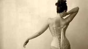
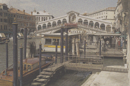
4. Color. The big choice is of course between monochrome and full color. Although sepia is shorthand (sometimes lazy shorthand) for “old photo,” there were plenty that were much more neutral and even some that were “cold tone” (ever so slightly blue). The tones were often subtle: the color saturation slider is your friend here. I normally start with sepia.
For sepia, just desaturate and then add red and either yellow or green, typically about twice as much red as yellow or green. Or tone a silver halide print. Different epochs had different sepias, whether more brown or more yellow: take account of this when you are trying to duplicate a specific look.
Move to full color, and most modern photographs are far more saturated than old ones. Until the invention of DIR couplers, more saturation normally meant more contrast, too, so you may find that as you turn down the saturation, you’ll do well to increase the contrast slightly.
5. Tonality. This is more of a concern with black and white than color, and it varied greatly with time, for various reasons. First there were exposure difficulties: many old pictures, especially indoors, are grievously underexposed, because the plates or films were so slow, so shadows are murky. Replicate this via a strong “S” in the “curves” control, or use real film and underexpose.
Outdoor scenes, on the other hand, were often very generously exposed and from the 1880s to the 1930s contact prints on POP (Printing-Out Paper) often had the most beautiful tonality. They owed this to their self-masking effect: as the print darkened, the image in the darker areas masked the silver behind, while darkening in the highlights (the darkest areas of the negative) continued unabated. Today, the easiest way to recreate this effect is via the “levels” control on a histogram, “opening up” the mid tones via the middle slider while leaving the end sliders untouched.
Later, with the advent of enlarging, prints became contrastier again, closer to the older underexposed look, though often with a much better range of mid tones. This is less often true of old contact-printed happy snaps, which are often so low in contrast as to look like different shades of cigarette ash. This was partly a result of the low maximum density of many old papers, but “one
size fits all” commercial developing and printing were also to blame in many cases.
 |
|
 |
|
|
6. Sharpness. This is once again more complex than it might seem, and once more we have to look at the difference between contact prints (usually in black and white) and enlargements.
Contact prints are mostly very sharp, even from box cameras, but when you start enlarging old negatives, quality often falls off a cliff: 2x was too much for most box-camera lenses and even for some films of the 1930s. The easiest way to retain contact-print sharpness is (surprise!) to stick with small pictures.
The best way we have found to do this is with medium format film, enlarged in the traditional manner, but not enlarged very much. Our favorite is Linhof’s 56x72mm format, enlarged 3x to whole-plate (61⁄2x81⁄2”). With a first-class lens and something like Ilford’s Delta 100, this can pass for a contact print.
In the digital realm, sharpening (via unsharp mask) is a good idea, and you can often get away with rather more sharpening than would look natural in a bigger print. With a 6-megapixel camera and a good lens, you can get convincing-looking postcards and surprisingly good 43⁄4x61⁄2” prints: more megapixels are in proportion.
Replicating enlargements is another matter, as they were principally affected by two things: lens sharpness and film sharpness. Today’s lenses are usually much sharper and contrastier than those of yesteryear, and the easiest way to replicate the effect of old lenses is actually to use old lenses. You cannot, on the other hand, use old film (at least not in date, and certainly not if you are shooting digital).
The easiest digital trick in either case is to resample the image to a fraction of its original size—down from (say) 3900 pixels wide to 1000 pixels wide—and then resample it up again to the original size. Obviously, the smaller you are going to make the final print, the more aggressive you need to be in the downsize/upsize trick: for a postcard-sized print from a 10-megapixel image, a 10x factor may not be excessive.
- Log in or register to post comments


