Searching For Website Perfection: And It’s Groundhog Day, Too!
Never was there a time when it was so easy or inexpensive to create a great-looking website than right now. I created my own site (www.joefarace.com) using a WordPress template from Obox (www.obox-design.com) that’s hosted on GoDaddy.com and the whole magilla cost a little over $100—along with lots of my own time. What about your site? If you read Web Profiles regularly you know that from time to time I like to feature Shutterbug readers and if you would like to see your website or blog featured here, click my site’s Contact button and tell me about it.

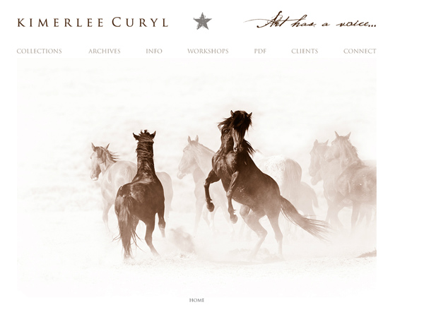
www.kimerleecuryl.com
Every now and then a perfect storm of amazing photography collides with equally amazing site design and that’s clearly the case with Kimerlee Curyl’s website. Curyl is the premier photographer for the Return to Freedom Wild Horse Sanctuary (www.returntofreedom.org), which is dedicated to preserving the diversity and habitat of America’s wild horses. Her unique images are arranged into nine different collections, each of which may be viewed as a slide show or individually with a unique and attractively designed scrolling list of thumbnails located under a larger center image.
Curyl shoots in color and black and white and while I was taken with the ofttimes abstract splendor of the monochrome images found in her Wild Mustangs: White collection that sympathetically shows the dignity of these wild and proud animals, I was taken aback by the sensitivity of her color photographs in Wild Mustangs: Vibrance that offer a raw and realistic look at these animals in their natural habitat. These are not the mustangs of a John Ford Western; Curyl’s images represent nature photography at its dramatically best, showing these animals interacting with one another along with their untouched, wild mystique. You have probably never seen horses photographed this way or with such a depth of understanding of the subject. Kimerlee Curyl’s images celebrate wild mustangs while at the same time offer a poignant statement about the need to preserve these magnificent animals and their ecosystem. If that’s not something that photography can do for the planet, what is?
www.fineart-photography.com
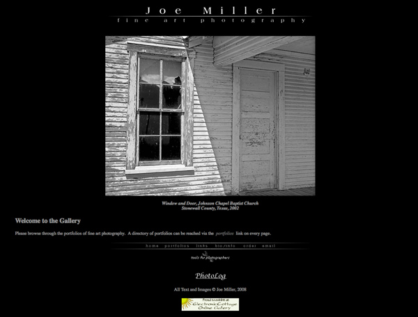
comJoe Miller considers himself to be a fine art photographer and admits the downside is that it sounds pretentious but the upside is that “you don’t have to give a crap about reality.” Yet while the images in the eight collections in his portfolio have a basis in authenticity, Miller’s interpretation gives the images something extra that transcends their reality. The images of Close City, Texas, in his Places collection, for instance, are grounded in genuineness but are imbued with a spirit of loss that’s also seen in the photography of Clarence John Laughlin. Miller’s Handtinted photographs are a mixed bag of subject matter but when you encounter “Serenity,” one of his flower photographs, its subtle composition and color will stop you in your tracks. Miller’s Salt Fork collection contains images made in the North Fork of the Brazos Salt Fork in Garza County, Texas, and resonates with the same quiet beauty that pervades all of his work but here contains deep textures that invite you to jump in and explore. In Badlands, Miller switches to color but his images lose none of the subtlety that exemplifies his style.
Click on “Tools for Photographers” at the bottom of each page to download a series of Excel spreadsheets that include a depth of field calculator, a filter factor chart, a conversion calculator of commonly used distance and temperature measurements, a calculator for bellows factor and f/stop adjustment along with a Table of EV that links aperture and shutter speed. Joe Miller is not only adept at capturing lovely, haunting images but also has the technical expertise to pull it all together.
www.donament.com
Before taking a look at Don Ament’s images, make time to read what he’s written in “The Artist.” Instead of a typical biographical sketch, Ament explains what drew him into photography—Kentucky’s Raven Run Nature Sanctuary—but more importantly tells you about what drives him now and that is an “attempt to give voice to a planet we have forgotten how to care for.” But rather than producing an environmental polemic, Ament’s Main Gallery is full of poetic images of nature that celebrate all that’s right with the planet, showing why we need to preserve it. Soft, silent images such as “Primeval Forest” contrast with the amazingly brilliant fall colors that abound in “Lit from Within” and yet both images are full of the technical mastery that Ament brings to his nature photography.
Images in his Gallery Diana were created using plastic, toy camera lenses originally made for a Diana camera but are used here to add a mystical softness that belies the humble optics used to make these photographs. “Hot Streak,” a color image of a snow-covered forest and a stream are balanced by the surreal monochrome image “All Bent” that produces an impression that is as much social comment as it is beautifully bizarre. Photo geeks can dive into his Tech Info page to learn how Don Ament makes and frames these images that are available for purchase by clicking the (what else?) Purchase tab.

www.mikeputnamphoto.com
Mike Putnam’s WordPress blog is a perfect example of the power of this platform to create stunning-looking blogs. Oh, it doesn’t hurt that Putnam is a gifted landscape photographer who uses this format to frame his spectacular images, many of which celebrate the splendor of Central Oregon. Putnam is old school and shoots these colorful and impeccably composed images using a large format camera with transparency film. You remember that stuff, don’t you? If you’re interested in his hardware, click on “Large Format Photography Gear” under Artist Info. Putnam is truly an artist and uses his blog to show recent work, perfectly framed within the blog, such as the stunning image of Oregon’s Multnomah Falls. In photographs such as this, he not only shares information on how he made the image but why, giving insight into this mega-talented photographer’s working methods.
The blog uses a two-column format with the main text and images on the wider left-hand column, while the right-hand column is used for additional information as well as providing access to his galleries. You see, this is a multipurpose blog that also provides access to his four-collection portfolio. Across the top of the screen are tabs that take you to his price list, stock photography, and list of exhibitions. A combination of excellent design and Mike Putnam’s simply spectacular images combine to show why the blog format may be a better choice for fine art photographers than the typical portfolio site often used by others.

- Log in or register to post comments
