- REVIEWS
Camera Reviews 
More Reviews Mobile Reviews Photography Reviews - GALLERIES
- VIDEOS
- BUYER'S GUIDES
Why Colors in Your Photos Look Wrong: A Quick Trick for Fixing Them (VIDEO)

Color grading may seem like a daunting task, especially if you're an inexperienced Lightroom user. But it's important to achieve accurate tones because unnatural colors can quickly kill an otherwise great shot.
Instructor James Feaver puts it like this: "if you're not happy with your colors or you just think they look ugly it usually comes down to one reason: White Balance." In this quick explainer he demonstrates a "quick trick" for getting far better White Balance in Lightroom. Best yet, you can take advantage of Feaver's simple tips whether you're shooting landscapes, nature photos, macro imagery, and even environmental portraits.
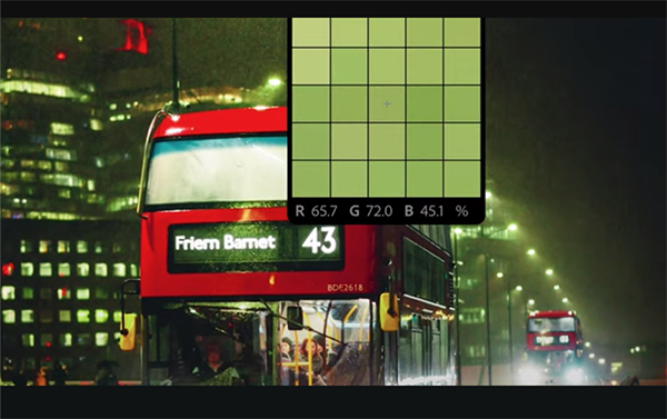
Feaver's demonstration photo is a perfectly composed and properly exposed image of a street scene after dark. A vivid red double-decker bus draws you into the scene that's super impactful because of illuminated windows, streetlamps, and reflections surrounding the main subject. So what's the problem: funky colors that don’t appear as they did through viewfinder.
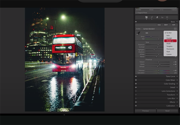
You may be surprised to learn that this image has already been edited in Lightroom. The result is slightly better than the original file, but let's face it, it still isn't good. That's because Feaver's preliminary enhancements didn't include adjusting White Balance. He intentionally skipped this step so he could demonstrate the concept and walk you through the simple procedure in the next five minutes.
The process occurs in Lightroom's Develop panel by expanding the Basics dropdown menu that includes several easy-to-use sliders with White Balance tools grouped into three sections. There's the Eyedropper tool, the two main sliders, as well as your Presets.
Feaver begins with the oft-ignored White Balance Presets. There are several available and Feaver notes how they mirror the ones inside your camera, namely Daylight, Cloudy, Shade, Tungsten, and the like. Keep in mind that once you make a choice, say Cloudy, "your camera will always use the Cloudy setting until it's changed. The good news when you forget (and the purpose of this lesson), is that you can rehabilitate poor color tones by following Feaver's instructions, after which you'll want to add this trick to your everyday workflow.
There's much more to learn on the London-based Photo Feaver YouTube channel, so be sure to take a look.
And on a related note, be sure to watch the tutorial we featured with another post-processing expert who demonstrates why you should use Adobe's amazing AI-based Adaptive Color Profile as the first-step in processing your photographs.
- Log in or register to post comments


![]()
Get the Latest Photo Tips, News & Reviews from Shutterbug!
| Camera Reviews Other Reviews | Mobile Reviews Photography Reviews Columns | News | Features | How-To | Resources |
 © 2025 Shutterbug
AVTech Media Americas Inc., USA
All rights reserved