Photo Websites that Get It Right: If You’re Looking To Improve Your Online Portfolio, Check Out These Photographers’ Sweet Sites

“We are advertis’d by our loving friends.”—William Shakespeare
Thanksgiving is a uniquely American holiday when friends come together and share a meal and their feelings for one another. The World Wide Web is another way we can share images with others, no matter where they may be located on this vast planet. Over the years I have made some really great friends who I would never have met except for the Internet, which is its real power. Here are a few photographer friends I’ve met online through their excellent websites.
nickbriggs.com
In producing feature films and television shows, the camera crew includes a still photographer or, in the UK where Nick Briggs is located, a stills photographer. Briggs’s understated website kicks off with a slide show displaying images from some of the productions he’s worked on and chances are you’re familiar with some, if not all, of them. Click on Galleries and you’re taken to a page containing his images from hits such as Downton Abbey, Shackleton, and Game of Thrones.
As a fan of both the books and HBO series, I opened Game of Thrones first. It follows the same format as the other 32 collections, with a large center image that can be viewed as a slide show or you can click thumbnails and view photographs at your own pace using built-in forward and back arrows. The images range from Briggs’s striking documentary photographs of Ned Stark (Sean Bean) with his sword Ice, showing how really big that sword is, to a thoughtful and beautifully lit portrait of Peter Dinklage as Tyrion Lannister. Shackleton provides a change of pace if only because of the frigid locations illustrating the practical challenges facing a stills photographer in keeping gear and himself warm, while at the same time managing to create stunning images of that ill-fated Antarctic expedition. There is so much to see that I suggest you start with your favorite show/movie but before long dip into Behind the Scenes where Briggs skillfully captures the less glamorous, down-to-earth reality of what goes on during production. Briggs captures these shots with the same technical skill, flare for the dramatic, and sometimes with a twinkle in his lens that are found throughout the hundreds of images on his site.
davidclackphotography.com
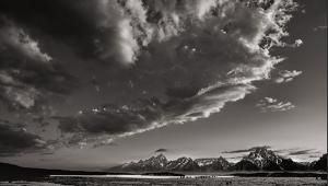
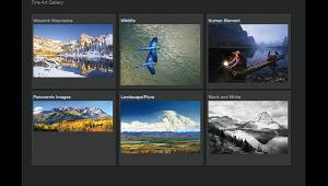
David Clack’s website is the perfect embodiment of what a fine art photographer’s online presence should look like. You land on an elegant page with a slide show displaying his work; across the top are page names with translucent drop-down menus that don’t distract from his photographs. His Portfolio contains 12 collections based on geographic locations, topics, and styles. Portfolio pages show small thumbnails that, when clicked, open a window letting you navigate the collection and I peeked into Black & White first because I was feeling monochromatic. Here I was greeted by work of great delicacy and even with traditional landscape images, such as “Mt. Owen, Ruby Range at Kebler Pass, Colorado,” you can almost hear a light wind blowing across a lake. While the photographs in the all-too-brief Mexico collection could have been made anywhere, there’s a strong sense of place in the colors and abstract shapes Clack’s immersive photographs evoke. I don’t know if Clack is a religious person but one collection is entitled The Cross, and rather than literal photographs of crosses, it features explorations of the iconic shape, leaving interpretation to the viewer. His New England collection contains bits and pieces with the tranquil colorations that speak of cloudy days and changing foliage colors, so reminiscent of the Northeast. Instead of giving us postcard views, Clack provides glimpses—the gestalt—of a place that sticks in your memory longer than the clichés. Clack lives in Colorado and has a gallery in Fort Collins but I’ve never met him. When I’m up that way again, I plan to visit the gallery.

karenstringerphotography.com
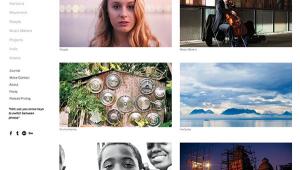
This month’s Shutterbug reader’s site features the introspective work of Karen Rozbicki Stringer, a Washington-based fine art photographer. She’s arranged her favorite images into eight collections. In the mostly monochrome—she throws in a dash of color on one image—Sequim-Dungeness Evocations, Stringer takes you on a walk along the river capturing the solitude of a pier and wharf built in 1891. With just a few pilings remaining, her photographs use graphic minimalism to reflect peace and stillness. Some, such as “He Walks Alone,” will have you searching for the “he” but when you find it, it’s an Easter egg changing your initial view of what this beautifully haunting image is all about. I like how Stringer provides captions for the images along with information on purchasing them. Some images in Intimate Landscapes are in color but she doesn’t beat you over the head with it, instead relying on the exquisitely precise compositions that characterize her photographs to speak to the viewer in quietly elegant terms. Everyone, it seems, photographs flowers but Stringer’s Floral Studies take on an almost balletic (I’m thinking Red Shoes-style Technicolor) performance with shapes mingling with shapes as color swirls around them in a dance-like way. “Greet the Day” is more than a flower photograph, it’s a dancer in grand jeté and Stringer clearly has the skill, vision, and experience to visualize images such as this, all the while turning commonplace nature into a close encounter of the very best kind.

Web Design Tips
During the time I’ve been writing Web Profiles, many readers have asked how to be featured on these pages. Sites are selected based on design and photography but ultimately images are front and center. A simply designed site with great photographs will be selected before a beautifully designed site with mundane images. But because design is part of the process, I want to offer a few tips on getting your site noticed, not just by me, but by everybody.
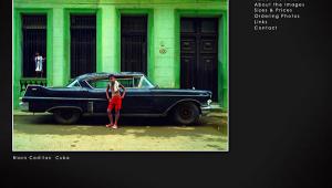
Avoid black backgrounds: As photographers we’ve beat this one to death and white text on a black background is just plain hard to read.
Have a dramatic splash page: The first thing anyone landing on your site should see is a signature image, not a portrait of you, your studio, or picture of an exhibit. These kinds of pictures belong in the About or Bio sections that you should also have.
Include a Contact page: I’m surprised how many sites lack Contact or About pages. If people like your site they want to know more about you and how to get in touch, even if it’s to send a fan e-mail, as I did recently to Bellamy Hunt of Japan Camera Hunter (www.japancamerahunter.com), a site that’s an indispensable resource for camera collectors.
Don’t use Flash: Many people disable Flash in their browsers to avoid animated advertising or improve page-loading time. A gray screen with the word “Flash” in the middle is what my iMac displayed when looking at the main page of an actual site submitted for Web Profiles. This is not what you want your customers or adoring public to see and seems to be a popular template I’ve seen used countless times. On top of that, you block 63.2 million iPhone and 61 million iPad users from seeing part of your site. Even if you attract an infinitesimally small percentage of those over 120 million people, why would you want to deny them access?
Ultimately, it’s your site and you can ignore any and all of these suggestions. Just as there’s no perfect way to make a photograph, there’s no perfect way to design a photographer’s website. In this column, I try to expose readers to all kinds of image making and am a sucker for cute and people working out of the mainstream because humankind does not live by photographs of Half Dome alone. You can recommend your own or a friend’s site by using the Contact page on www.JoeFarace.com.
Joe Farace invites Shutterbug readers to visit his personal websites, including www.JoeFarace.com and www.JoeFaraceShootsCars.com, which also includes a blog with tips on photographing automobiles and motorsports.
- Log in or register to post comments
