Our Favorite Reader Websites: Making a Great Online Portfolio Requires Vision & Hard Work
“Genius begins great works; labor alone finishes them.”—Joseph Joubert
Each month in this column I gather a collection of websites, sometimes with a loosely related theme. This month’s sites have little in common except an excellence of vision, proving they are not only most uncommon but the result of hard work, which is what the above quote is all about. If you would like to see your site or a friend’s featured here, read “How I Select Web Sites for Web Profiles” at the bottom of this story.
dimitre.com
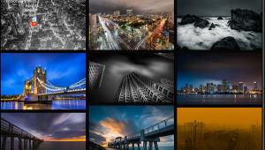
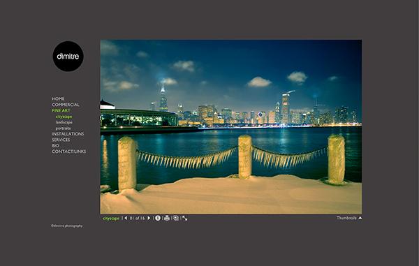
Dimitre is a Chicago-based commercial photographer whose website showcases his fine art as well as work for clients. His Fine Art gallery offers images in Cityscapes, Landscapes and Portraits collections. People occasionally appear as compositional elements in Cityscapes, which happens infrequently in his Commercial galley. They’re more likely to appear in his fine art photographs celebrating the diverse architecture of Sandburg’s City of Broad Shoulders.
Dimitre creates a somber mood in low light situations where he’ll occasionally sprinkle a dash of HDR adding a touch of unreality you’ll also see in his straight images, many of which may surprise you in their views of such a well-documented city. Yet Dimitre always manages to show us something new. Like his other fine art images, Landscapes may be viewed in a modest size or full screen and if you have a 5K monitor, these photographs will delight you with their quiet demeanor. In Cityscapes something is always going on but the atmosphere changes to one that’s colorful yet introspective.
While some of his portraits have a black and white documentary feel, the rest veer off into the bizarre, Dali-esque and even grotesque. Some portraits, consciously or otherwise, seem to be inspired by the late William Mortensen’s (1897-1965) playbook mixing special effects, montage and texture while defying traditional norms. It’s clear that Dimitre’s expertise lets him deliver high quality work for his clients but when shooting for himself he produces consciousness expanding and genre bending images that make you sit up and pay attention.

jimmygekas.com
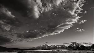
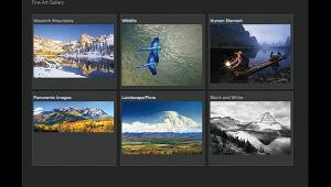
Jimmy Gekas’ elegant website makes the perfect compliment to his elegant nature photographer and is built on the Widerange Galleries (www.widerangegalleries.com) platform. Collected in 10 galleries, with mostly geographically oriented names, I peeked inside Black & White first because of it’s lacily intriguing thumbnail.
The images, for the most part, eschew big Ansel Adams vistas instead focusing on vignettes including the snow-covered tree photographed in Yosemite National Park that fascinated me. What kept me looking was Gekas’ singular vision combining traditional monochrome nature photography themes with a fresh, contemporary look enhanced with masterful craftsmanship. The Aspen Intimates galley contains subtle images of great beauty that seem almost musical—think Bach—in their construction. The subtle color of aspen leaves and pale tree bark create a visual fugue while highlighting shapes where nature twists the trunks into dance-like formations with Gekas conducting the orchestra with a camera instead of baton.
The California Coast galley explodes with color showing seascapes that sometimes seem like alien landscapes then quickly switches to views that create a mood of immense calm, showing the power of nature over us all. Gekas never beats you over the head with his massive skillset abundantly shown in the other collections, instead letting the subtlety of his work give us a window into a world of natural beauty that few of us get to experience first hand.

roycraftart.com
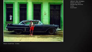
Walt Roycraft is a classical landscape photographer whose site reflects the simplicity and directness of his images that merge an obvious passion for nature producing a body of the work that spans the four seasons. Maybe that why his galleries contain four seasonally related collections plus Barns, which is where I headed first. Photographing barns is a passion of mine and I was struck by Roycraft’s multi-faceted approach to photographing not just exteriors but also the kind of details that make these American icons so special.
The images in the collections may be viewed individually, as large thumbnails, or as a screen filling slide show illustrating the lushness of his immersive image making, creating a you-are-there feeling surrounded by nature and alone in the world. Far from being bleak, his Winter images, even one named ”Solitude,” produce a feeling of tranquility and hope for the coming Spring, while making you content just to sit and let the snow fall on you.
Like most of Roycraft’s landscapes his Fall image embrace an intimacy, a more direct connection to nature that Henry David Thoreau would have appreciated. Summer contains fewer images but a photograph of a cave interior called “Passage” is a Rorschach test in its complexity that pulls you in to explore its nooks and crannies. Throughout his tour of the seasons, Walt Roycraft shows how, in what seems like an over-urbanized world, that quiet, untouched places like this exist where we can step back in to the primordial forest and become one with nature.

Longwhitecloud.photoshelter.com
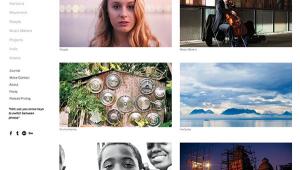
Gerard Smith is a Portland-based fine art photographer using the Photo Shelter (www.photoshelter.com) platform for his Web site. His Earth Portraits gallery contains five collections, while the special Oregon Cost edition contains one— Wintercoast. In it he displays a group of monochrome landscape images as thumbnails that, when clicked, shows larger images with forward and back arrows for navigation. Clicking the full screen button, well, fills your screen with the spare and elegantly crafted images that, in color, might be called seascapes, but instead Smith has produced delicate photographs of great beauty.
Want color? In The Land, Smith literally tackles this subject with landscape images that often turn the genre on its end, showing the land, as in “Painted Hills,” as a textural mass that’s often more abstract than literal. To see if you’re paying attention, he tosses in occasional black and white images such as “Mount Hood, hiking up to McNeil Point” turning an oft-cliché subject into a captivating experience.
In The Sea, you’ll see color images echoing his dry land work brimming with the textures of rocks or snow and sometimes rocks and snow but always with a touch of reverence for this subject matter. The dynamic photographs in his Washington collection are worth a peek as well. While fewer in number than the Oregon images, moody photographs, such as “Orcas Island Jetty,” like all of Smith’s work are not to be missed.
How I Select Web Sites for Web Profiles
I try to feature work by photographers whose images intrigue and inspire me and look at dozens and sometimes a hundred websites to select what appears here. Why so many? Many photographers I contact don't respond or refuse to give permission to feature their site. I think (but don’t know for sure) it’s because I don’t give prior copy approval before submitting the column and they assume I’ll write something negative, which shows they haven’t read the column or checked links I provide. Others think there’s a charge; there is definitely not. If you would like to see your site in Web Profiles, send me an e-mail via the Contact page of www.joefarace.com and while I can’t guarantee your site will be featured, I promise to look at each and every one submitted.
Joe Farace invites Shutterbug readers to visit his own Web sites including www.JoeFarace.com and www.JoeFaraceShootsCars.com, which has a blog containing tips on photographing automobiles and motorsports.
- Log in or register to post comments
