Our Favorite Reader Websites: 3 Galleries Prove Photography Is More Than Just Taking Pictures
A reader recently e-mailed me, asking, “I noticed you and other professional photographers don't always use right-click protection or watermarks (on your sites.) It seems like you'd want to protect your photos from unauthorized use. I'm not a pro but even I wouldn't want someone to grab some of my photos as their own.”
One thing I do on my sites is embed a copyright notice within each image that’s visible when moused over. It’s easy to do using WordPress and while I’m naive enough to believe people are more good than bad I recognize there are sociopaths who don’t know the difference.
In the real world there is no protection from the unscrupulous. Thieves stole Van Gogh’s paintings—and even da Vinci’s Mona Lisa—from museums with tighter security than anything you can place on a website. And speaking as someone who has had their images stolen, I have two words for you: screen capture.
Nothing will stop a determined thief so the single best thing you can do is register your images, formally copywriting them. While cluttered with ads, WikiHow (http://www.wikihow.com/Copyright-Photographs) shows how to do it in three easy steps. That way, if a theft occurs, you can bring down the hammer of the law onto the thief.

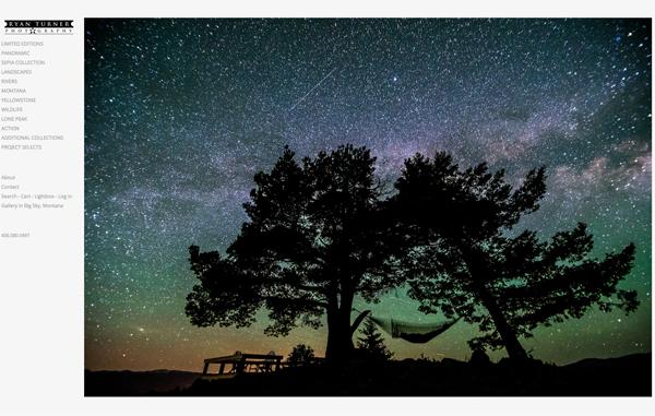
ryanturnerphotography.com
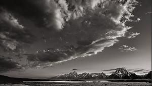
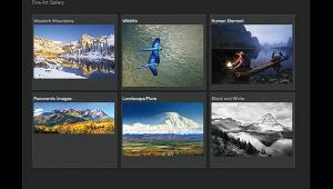
For the past 15 years, adventure photographer Ryan Turner has been shooting landscape, wildlife and lifestyle images, primarily in Montana. His ten collections are full of the kind of the kind of breathtaking landscape imagery that demonstrates why I consider Montana the most beautiful state in the USA.
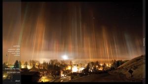
Just peek inside Turner’s Fine Art collection and look at the quiet beauty of “Lone Peak & Indian Paintbrush” or the otherworldly “Beam of Light” showing a sundog at the Big Sky Resort in early morning. Several images in this collection are panoramas, something Big Sky country is well suited for and the Panoramic collection is full of meticulously crafted horizontal and vertical panoramas, including “RTPinc2010-2.jpg” showing a rainbow over a field that exemplifies the very reason the panorama format was created.
Turner’s Sepia collection features monochrome images of wildlife, including majestic elk, buffalo and big horn sheep, some of which could easily be classified as portraits. His photographs are presented as a proof sheet and when an image is clicked a larger version appears allowing you to click left or right to navigate the collection. It’s all very intuitive, making it easy for visitors to examine photographs of particular interest. And there’s plenty here to be interested in; take your time and immerse yourself in the work of a photographer whose technical expertise is wrapped around an unerring aesthetic sensibility allowing you to appreciate the beauty of the natural world— Montana style.
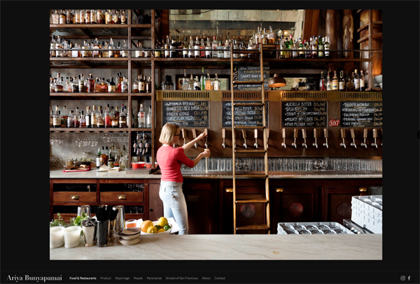
colephoto.com
In my previous column, I urged photographers to ensure that their splash page makes a splash showing their images in the best possible way. Cole Bunyapamai’s site does this in an impressive way focusing squarely on the photographer’s skill set. But it wasn’t always that way. In the sixth grade Cole enrolled in a photography course and remembers thinking it was “pointless.” Today he says, “I didn't know it then, but that class was to have a big impact upon my life.”
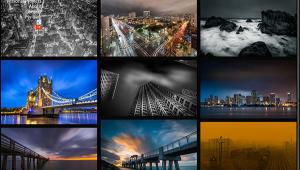
His six galleries are arranged in a horizontal row at the bottom of the screen— no drop down menu required—so you can jump right into exploring his work. His Fashion photographs have a postmodern vibe that meshes technical ability with Cole’s inherent aesthetic sensibilities. I just wish there were more images. In Panoramas he takes a format that usually doesn’t usually work well on the Web, well, work.
Cole is at his best in the People gallery utilizing a combination of photojournalism and candid portraiture approaches creating a “you are there” feeling showing people in authentic yet enhanced realistic settings who are clearly interacting with him, proving that if you truly love people, that affection will be visible in your photography. Throughout it all, Cole’s approach on image selection is that less is more, making you want to see his other photographs (don’t miss his Instagram feed) and demonstrating that the best way to keep people coming back to a site is have them looking for what’s new.

tetedeloup.com
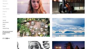
Grégoire Huret is a self-taught photographer based in Paris and shoots 90% film and 10% digital capture. (“Tete de loup” literally means wolf head but in idiomatic French translates as children, much as we call ’em “kids.”) Huret’s low key site design has a white background instead of the black many photographers feel compelled to use that results in white text on black, which isn’t all that easy on the eyes. A white background, on the other hand, provides a digital paper effect and making text easy to read while providing equal emphasis on the photographs.
In this case, there are nine groups of image that read as classical photo essays, rather than mere collections of images. All of his film-based essays are monochrome; the two digital are color and the contrast in how Huret approaches each is different and interesting. In Nice, for example, the grainy black and white images have a loose reportorial, even voyeuristic style.
While in Digital 2 the images are brighter (and obviously more colorful but really colorful) and he seems physically closer to his subjects allowing them to play out their roles on life’s stage. Which is best? It doesn’t matter because both are impressive in their own but dissimilar ways. Huret is a keen observer of the human comedy a recorder of the everyday but not in a haphazard street photography way. He is part anthropologist, part philosopher and all artist. The simplicity of the site design allows you to get up close and personal with his images and the scenes and people depicted within.
The Ever Changing Web
When surfing the Internet looking for these selections, please keep a few points in mind. None of the sites featured is affiliated with Shutterbug magazine or me. The staff checks to make sure these sites are available as the column goes on-line but access to anything on the Web can occasionally be unreliable and the sites may change by the time you read this.
If you want your photography website to be considered for inclusion in an upcoming edition of Web Profiles, click the contact button on my website (www.joefarace.com) and tell me about your site. You could find your online portfolio featured right here in this space!
(Joe Farace invites Shutterbug readers to visit www.JoeFarace.com and www.JoeFaraceShootsCars.com, which has a blog containing tips on photographing automobiles.)
- Log in or register to post comments
