Monochrome…Never Out Of Style; Black & White And Read All Over Page 2
www.keithburgessphotography.com
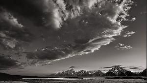
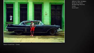
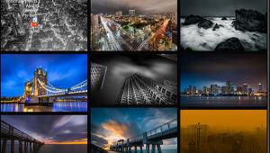
Keith Burgess’s vividly designed site matches the drama his images produce. The site is from FolioLink (http://foliolink.com) and has much more style than some cookie-cutter site designs and template-based sites I’ve encountered, especially his Monochrome gallery images. The spectacularly well-composed (and exposed) images found in Burgess’s Night and Twilight galleries could be easily called “monochrome” as well. Yes, there’s color in these shots but most fit the classic definition as being “done in different shades of a single color.” His Monochrome gallery is filled with simply amazing images, some of which recall the paintings of Edward Hopper while others contain reflections of Margaret
Bourke-White’s Machine Age images for LIFE magazine, but through it all bear a personal stamp that’s strongly reinforced by the way Burgess handles shadows. He slams those shadow images into place reinforcing a noir sensibility that I’ve never seen used with this kind of subject matter. Some might see echoes of O. Winston Link here but they would be wrong. Keith Burgess photographs railroads and has received awards from the Center for Railroad Photography and has had exhibits in the California State Railroad Museum in Sacramento, but his images contain his own unique point of view that’s different than Link’s oft-dazzling explorations of night railroading.
 |
|
|
www.foxvalleyphotographyproject.com
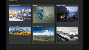
Craig Wassel created the Reader-of-the-Month’s website because he feels that “we [in Northern Illinois] are surrounded by beauty and wonder.” The mission of the beautifully executed Fox Valley Photography Project site is “to use the eye of the lens to unveil its hidden beauty, revealing its light and form with sepia-toned photographs”—and infrared, too, as it turns out. To that end, he’s collected his photographs in 13 galleries filled with warm toned but not always nostalgic imagery. The photographs in his Chicago, Illinois galleries are full of wide-angle architecture made using incredibly interesting camera angles, putting an entirely different postmodern approach to capturing this most-photographed city. If somebody told me they were made in Brasilia I would have believed them. Then Wassel heads on over to the Fabyan Forest Preserve where the sepia toning of his nostalgic images of bridges and windmills seems perfectly matched. His IR captured and toned image “The Fabyan Windmill” is so perfectly crafted that you don’t care what tools were used, only what a great image he’s wrought.
There are few if any people in Wassel’s images and because of that and his impeccable composition these warm-toned images create an air of serenity, especially in photographs such as “Wayne Woods Forest Preserve” in the Batavia, Geneva, and St. Charles area gallery. But even the dramatic angles in the Chicago images never make you feel frantic, and instead appeal to the left-brained processes you might use assembling a puzzle. One thing that’s not puzzling is the power, scale, and scope of Craig Wassel’s vision.
 |
|
|
- Log in or register to post comments
