Fine Art Photographers On The Web: A Website Is ATwo-Way Street
During the year I look at thousands of websites, selecting the ones that eventually appear here, and one of the most problematic design aspects I see is the Contact page. Believe it or not, some websites don’t have one! More than once this year I found a photographer with huge amounts of talent and no way to contact them about appearing in Web Profiles. Some sites have requirements that all data, including a phone number, must be provided before contacting the photographer. If a potential client wants you to have their number, they will call you. I prefer not to have visitors jump through too many hoops to contact me but had to implement an “enter the text” form—Captcha, a free WordPress plug-in—because spam robots overflowed my mailbox. The bottom line is your bottom line and you should make it easy and convenient for clients to contact you. Tip: Put your phone number on the Contact page and write your non-linked e-mail address in long form (joefaraceatgmaildotcom, for example) and while spambots can read it they won’t be able to do anything with the information.

www.richhelmer.com
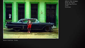
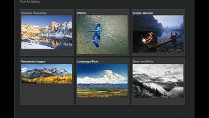
Rich Helmer is an Arizona-based fine art photographer whose lush and richly textured photographs show he is equally at home in the world of realism and abstract imagery. Photographic pioneer Alfred Stieglitz explored abstract photography by making a series of cloud pictures he described as Equivalents; Helmer’s Clouds & Sky collection attempts the same thing—without any obvious homage—producing a series of dramatic and colorful images. In it, he uses the shapes of the clouds to create actual compositions, rather than just the colors—that are here used as seasoning—to carry it.
By using zoom and camera motion Helmer gets abstract in a collection of the same name, creating images from the simple to poetic, as in “Más Allá del Árbol Rojo.” He gets down to earth in Places of Worship but refuses to allow blatant realism to interfere with his vision for these churches and missions from the bold (“Escalera al Cielo”) to the fantasmic (“Fantasmas en el Viento”), even tossing in a little HDR to see if you’ve been paying attention. Doors and windows typically symbolize a journey into the unknown and, in a collection with that name, Helmer takes us on a trip up to but not through a series of door photographs that while endowed with beautiful colors and impeccable framing lets you enjoy the experience while wondering “what’s on the other side?” In this gallery as well as some of the others, Helmer uses the panoramic format, producing cinematic images that make it feel like you can walk into them. Rich Helmer’s website is well designed and functional, providing the perfect showcase for his 13 image collections. Take the time to explore and enjoy.

www.wheatonmahoney.com
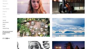
Wheaton Mahoney photographs people. Her style is direct and honest, photographing subjects against solid-colored seamless backgrounds and placing the focus directly on them. Occasionally she introduces props, and when she does, as with the woman with the bright blue shoes, the concept remains simple yet fun loving, while still focused on capturing the subject’s personality. It can even be silly, as seen in her image of a woman with a green wig making a kiss-kiss face or the distinguished gentleman wearing a ridiculous hat made from newspapers. Her Faceless Portraits contains images of men, women, and children not wearing clothes but they could not by any stretch of the imagination be considered nudes. Heck, there’s even a face in one of the “faceless” portraits.
Mahoney’s beautiful and thoughtful portraits literally comprise an online course in contemporary portraiture. Completing the class lessons is a gallery of Behind the Scenes images, showing Mahoney at work. But there’s more, especially when she leaves the studio to create the photographs found in the Black & White gallery, exhibiting a different aesthetic with the purity of design that pervades all of Mahoney’s portraits but with more angular shapes. Here she shows us images of stark beauty, as in the panoramic images of leafless trees. This is flipped upside down in the colorfully and softly rounded flower images found in Floral that run the gamut of elegant to abstract. Wheaton Mahoney obviously loves people but extends her talents to other genres, and when she does you don’t want to miss a single frame.

www.garyhallphoto.com
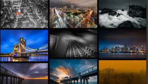
Vermont-based Gary Hall originally trained as an Army Signal Corps photographer and now specializes in photography for architects, builders, and the hospitality industry. This specialization is reflected in three collections in the Commercial gallery that show his talent and remarkable output in the kinds of crisply detailed interior and exterior photographs that would warm an architect’s heart, as well as anyone who appreciates finely crafted commercial imagery. Images are displayed in large thumbnails that when clicked fill the screen; mousing over “Image Info” pops up a translucent sliver with the kinds of details that architects—and Hall’s potential clients—might enjoy, not so much for photographers.
His four collections in the Fine Art gallery show a different side of Hall. Instead of the tightly controlled, linear architectural images, these landscape images are softer, shot in monochrome, and are sensuous when contrasted with his architectural photographs. There is also tranquility here. While people occasionally appear and sometimes are primarily featured in Hall’s commercial photographs, in this gallery there is a decided lack of humankind or even the hand of man. All of the images found in the Fine Art gallery comprise a series that Gary Hall calls The Enduring Landscape and are a love song to the beauty of the state of Vermont and are crafted in a hybrid fashion: images are captured on film that is scanned, manipulated within Adobe Photoshop, and output on an inkjet printer.

http://jaywesler.com/
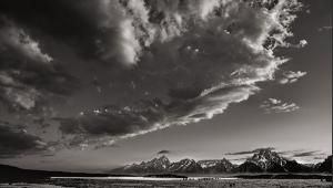
August’s Blog-of-the-Month is by Jay Wesler, a Montana-based fine art photographer who specializes in Western landscape and nostalgic cityscape imagery. His blog is the model of what a fine art site should look like. Its clean, crisp design focuses on the images with a minimum amount of text supporting Wesler’s stunning photographs, not vice versa as is often seen these days in web design. While some blog posts announce upcoming shows, most are centered on one of Wesler’s dramatic monochrome images with supporting text acting as an extended caption. You won’t find lens or exposure data or even N+1 developing schedules; instead the words offer a sense of what Wesler was thinking when he made the photograph and more importantly why he did.
Wesler works in the black-and-white landscape genre and kicks it up a notch by displaying exceptional technical prowess, but more than not also a deep sense of the aesthetics and traditions of the media. Click on “Photographs” in the header to see a matrix of thumbnails that when clicked enlarge and provide Previous and Next buttons to let you navigate through a series of one beautifully realized landscape after the next. Jay Wesler is truly a virtuoso photographer producing classical handmade selenium-toned prints and special edition prints that show the majesty of the state of Montana as well as his own prodigious talent.

- Log in or register to post comments
