Software How To

Sort By:  Post Date TitlePublish Date
Jon Sienkiewicz  |  Feb 05, 2015  | 

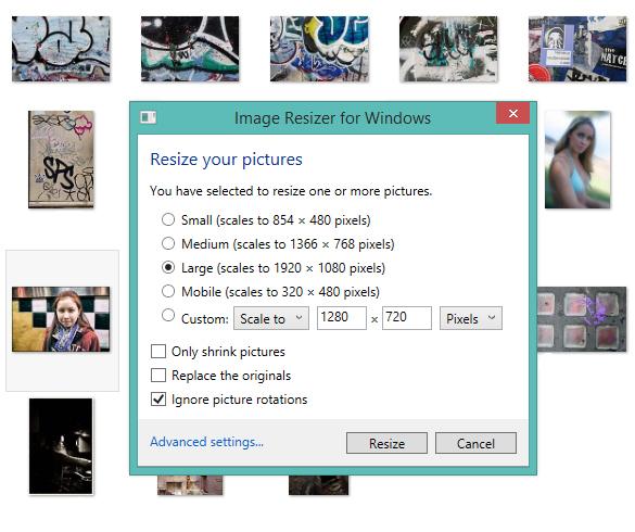
Wouldn’t it be great if you could resize a batch of images simply by right-clicking them and selecting their new dimensions from a menu? Windows users now can—even on 64-bit machines running Windows 8.1.

Jack Neubart  |  Dec 12, 2014  | 

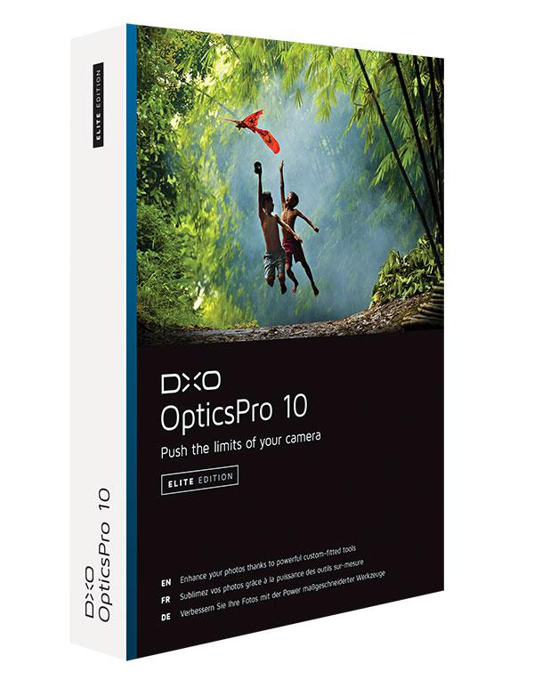
I’ve worked with DxO's OpticsPro imaging software for several years and have watched this program evolve and make great strides as a Raw image converter. What the new DxO OpticsPro 10 version of the software brings to the table is a cadre of new features and improvements. But are these enough to catapult this software into the top tier, or is it still playing catch-up?

Howard Millard  |  Nov 24, 2014  | 

Yes, you know that the tools and filters in Adobe Photoshop and Elements can do many amazing things, but did you know that they can empower you to make your own planets? If you have yearned to create and rule your own worlds (and who hasn’t?), then pull up some of your images and fire up Elements or Photoshop. We are going to create a galaxy of new worlds.

Howard Millard  |  Sep 30, 2014  | 

Are you someone who appreciates the richtones, colors and textures of 19th and 20th century alternative photo processes? With onOne Software’s Perfect B&W (www.ononesoftware.com), you can imbue your own images with these classic looks, and you won’t have to spend days in the darkroom to do it. Options include Platinum and Palladium, the warm beige tones and mottled surface of Calotype, the blue hues of Cyanotype, the buff tones of an Albumen print, the velvety reds of a warm Carbon print, even the look of a Tintype and many more.

Jon Sienkiewicz  |  Sep 25, 2014  | 

Adobe announced Photoshop Elements 13 and Premiere Elements 13. Both have cool new features. If you’re a user of version 12, should you upgrade? The answer is: it all depends. Here’s the advice I give my friends.

Howard Millard  |  Sep 24, 2014  | 

If you are an aficionado of the rich tones and subtle gradations of fine black and white and toned images, Tonality Pro 1.0 from Macphun is a tool you will want to try. For Mac only,  the Tonality black-and-white photo converter is available as a stand-alone and as a plug-in for Adobe Photoshop, Lightroom, and Elements, as well as Apple Aperture.

Jon Sienkiewicz  |  Sep 04, 2014  | 

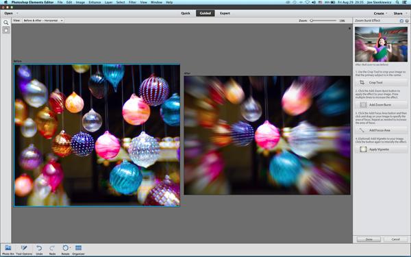
Last month readers enjoyed our Easy Photo Tip that explained how to zoom during exposure to create an exciting special effect. But a few readers had trouble mastering the technique. Here’s a way to achieve nearly the same results using Photoshop Elements 12.

Jon Sienkiewicz  |  Aug 22, 2014  | 

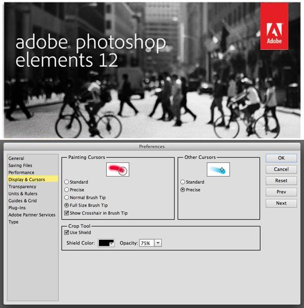
Many features of Photoshop Elements can be customized to suit your liking. Surprisingly, some experienced users overlook this powerful capability. A great place to start is at the Preferences menu. This screen shot is from the Mac version, but the same concept applies to Win as well as full-blown Photoshop products.

Jim Zuckerman  |  Aug 19, 2014  | 

HDR stands for High Dynamic Range. What this refers to is the digital sensor’s ability (or lack of ability) to render good detail in both the highlights and the shadows in a photograph. Our eye/brain combination is extremely sophisticated, and as we look at a contrasty scene (such as a landscape in noon sunlight) the detail in the shadows and in the bright sunny areas is quite clear to us. A photograph will not look the same as we see it.

Howard Millard  |  Aug 19, 2014  | 

Whether you need to add special effects and edges, perfect a portrait, enlarge a small file for a big print, erase an unsightly sign, pump up detail, add lens blur, or simply make basic color and tonal corrections quickly, Perfect Photo Suite 8 (PPS8) from onOne Software has an incredible number of tricks up its sleeve. What’s more, it works as a stand-alone with layers and masks if you seek these more advanced options. With eight modules and hundreds of one-click presets, the tools in PPS8 for automated and manual enhancements help you to correct, stylize, and retouch images in a layered workflow.

Jon Sienkiewicz  |  Jun 05, 2014  |  First Published: Apr 01, 2014  | 

We live in a world of color. Rendering a multicolored scene in monochrome, or as “black and white” (in quotes because that label is a misnomer), is a paradox. Back in the old film days, the difference between shooting color and shooting black and white was explained like this: amateurs begin with black and white, graduate to color, and when they really understand their art, go back to black and white. I subscribe to that theory, and that’s why my mission today is to warn you to never let your camera create monochrome images for you.

George Schaub  |  May 28, 2014  | 

The image color of even a conventional black and white silver print is rarely black, white and grayscale shades. It may be warm (golden) or cold (blue) neutral or toned (sepia, magenta). Over many years print makers and chemists developed paper and developer combinations, as well as after-printing toners, to add additional color to monochrome silver prints. For example, using a warm-tone paper such as Agfa Portriga and a warm-tone enhancing developer, such as Selectol Soft, could alter image color. This yielded brownish blacks and creamy whites. A cold-tone paper could be developed in Dektol and after fixing toned in a mild dilution of rapid selenium toner for added “snap”, resulting in a “harder” bright white/deep black effect.

George Schaub  |  May 28, 2014  | 

Human visual perception is a wondrous thing—it allows us to see a wide spectrum of colors, with all the subtleties and shades, lights and darks, pastels and richness of the earth and the heavens. To see in black and white is an abstraction of that world, one that perceives luminance, or brightness, without the benefit of hue. Yet hue, or color, and its shades, often determine what tones, or grayscale values, will be seen in black and white. If one were always to see the world only in black and white it would be considered a deficiency of vision. But to see that way occasionally, and to be able to render what we see in a monochrome fashion, opens the door to different perceptions and feelings about the world, and yields a unique form of expression in the bargain.

George Schaub  |  Feb 27, 2014  |  First Published: Jan 01, 2014  | 
There are many ways to share images these days, from social networks to clouds to full-fledged e-commerce platforms. For some, simple online albuming will do, but for others it can become an involving project that puts your images on the Internet in a very engaging way. It’s not only in the personalization of the look and feel of the wrapper around your image content that can separate your site from the crowd. It’s also the ability to work cross-platform, include an e-commerce component, and allow for a “translator” that can make your site accessible to folks and even clients around the world that can add to its attractiveness and functionality.

George Schaub  |  Feb 24, 2014  |  First Published: Jan 01, 2014  | 
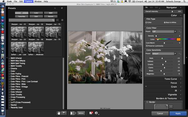
I have always had mixed feelings about so-called “film simulation” software, programs that offer one-click presets that add effects and options for manipulating digital images. On one side, I am unsure why the designers use visual references to types of film for their preset IDs. It strikes me that an increasingly small proportion of folks relate to them. On the other side, I admire their offering programs that open up a raft of image expressions in easy to attain fashion. I will not revisit that discussion here, although the near concomitant release of two such programs, Alien Skin’s Exposure 5 and DxO’s FilmPack 4, makes it tempting to do so.

Pages

X