Jon Canfield

Jon Canfield  |  Feb 19, 2016

There are times when a global adjustment to color, whether it’s a saturation change or a modification to the hue of the image, isn’t appropriate. You may just need to boost the color in the sky or make a small change in the color of some other element in the photo. While you can do this type of adjustment with Photoshop through the use of adjustment layers and masking, that can be quite a bit of work and obviously it requires Photoshop, or something similar, and not everyone is willing to invest in or learn another piece of software.

Jon Canfield  |  Sep 16, 2015

A popular option for many photographers looking to print images at up to 17 x 22 inches has been the Epson 3880 printer (and before that the 3800). Essentially an affordable option to Epson’s professional level 4800 and 4900 printers, the Epson 3880 and 3800 use smaller ink cartridges and forgo the ability to use roll paper. It’s been several years since this photo printer lineup has been updated, so when Epson gave me the opportunity to review their new 17-inch SureColor P800 I was interested to see what they were able to come up with to improve an already very good printer.

Jon Canfield  |  May 26, 2015

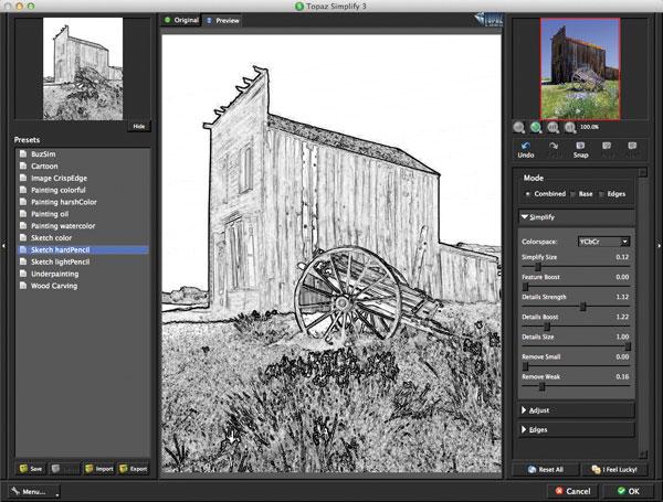
Sometimes a straight photograph isn’t the goal when we capture images. Thanks to a number of programs, you can take your photograph beyond the ordinary and turn it into a work of art with a few clicks of the mouse. One such program is Topaz Simplify (www.topazlabs.com, $39.99). Running standalone or as a plug-in for Adobe Photoshop and Lightroom or Apple’s Aperture, Simplify has a number of presets ranging from cartoon look to wood carvings to help you get started. Additionally, if you create your own look, you can save it as a preset and share those presets with other users.

Jon Canfield  |  Nov 19, 2013  |  First Published: Oct 01, 2013

Color calibration is the key to obtaining an accurate reproduction of what you saw when capturing the image, and what is reproduced on screen or paper. It’s long been considered a bit of black magic as to how it is done, what with terms like gamma, color temperatures, luminance, and the like as part of the mix, but the simple fact is that unless you’re working on a calibrated display you don’t quite know whether the greens, blues, or other colors you are seeing are actually what everyone else is going to see, or what you’re getting when you look at the print you’ve made.

Jon Canfield  |  Jun 07, 2013  |  First Published: May 01, 2013

Canon’s 13x19”-sized printers, the PIXMA Pro9500 Mark II and PIXMA Pro9000 Mark II, have had a longer life than most, but have been replaced with two new models that are similar to the PIXMA PRO-1, introduced over a year ago. New features on both the pigment-ink PRO-10 and dye-ink PRO-100 include Wi-Fi and AirPrint compatibility, a new plug-in to make printing easier, and a refined inkset.

Jon Canfield  |  Nov 20, 2012  |  First Published: Oct 01, 2012

I’ve been a long-time user of Wacom graphic tablets as part of my editing workflow. Making selections, painting a mask, and many other operations are not only more intuitive with a pen, but you have much finer control than you do with a mouse or trackpad. Until now, the Intuos4 Wireless tablet with Bluetooth has been what I considered to be as close to perfect as you could get. Used either left- or right-handed, I can have it plugged in via USB or use with Bluetooth when traveling or when I need to be a bit further from the computer, as when I’m teaching a workshop. When Wacom announced the Intuos5, I was curious as to what could possibly be improved upon from the current model, so I was anxious to take a look.

Jon Canfield  |  Sep 06, 2012  |  First Published: Aug 01, 2012

One of the most common complaints about digital imaging is the lack of consistency when going from one device to another—most commonly screen to print. Dark prints are the typical complaint, but color shifts are also a contributor to choice language and lack of hair. Yes, we tweak the image until the sky is that perfect hue of blue, or the skin tones have just the right amount of warmth and vibrancy. When it’s all done, the image is posted online or printed and it looks nothing like what we expected. The image is too dark, skin tones are too red, any number of problems. Where did it go wrong?


In almost all cases, the culprit is an uncalibrated display. Back when CRT displays were the common screen type, color could be wildly different and it was usually pretty easy to detect when the display was at fault. With modern LCD displays that isn’t necessarily the case—color is often close to correct in hue, but luminance, or brightness, is where the problem usually lies.

Jon Canfield  |  Jul 13, 2012  |  First Published: Jun 01, 2012

Photographers, especially those dealing with large numbers of images, are always looking for ways to speed up the workflow and spend less time in front of a computer and more time behind a camera. Applications like Lightroom have improved the process tremendously, making cataloging and image adjustments easier and faster than before. If you have adjustments that you apply frequently, you can use presets to make it a single-click process, applying a number of adjustments in one operation.


Kevin Kubota has been providing presets and tools for both Photoshop and Lightroom users for quite a while now, and one of his products is a combination of a package of presets for Lightroom and a mini keyboard from RPG Keys that looks much like a numeric keypad on your keyboard. Available as a bundle for $349, or as a rental for $19.95 per month after a $49 setup fee, you get over 100 presets that do everything from black-and-white conversions to skin tone enhancements (and a number of interesting edge effects).

Jon Canfield  |  Mar 28, 2012  |  First Published: Feb 01, 2012

Digital black and white has probably never been more popular than it is today. All of the major editing programs like Adobe’s Photoshop and Lightroom and Apple’s Aperture support black-and-white conversions natively, and at a much higher quality than just a few years ago. While all of these programs can do black and white you can take your monochrome imagery to the next level with plug-ins, specific task programs that use the architecture of the main program to get the work done. These plug-ins (which may be available as “stand-alones” as well) produce some amazing work, letting you emulate various film types, grain patterns, and more, usually working with “presets” (image looks) that can be modified with ease to customize every image. Combined with the improved output from recent inkjet printers, there has never been a better time to explore digital black and white than today.

Jon Canfield  |  Nov 01, 2011  |  First Published: Sep 01, 2011

There are few things in digital photography more frustrating than problems with color fidelity. One of the most commonly heard complaints is “my prints don’t match my display.” While color accuracy is improved with LCD displays, it isn’t perfect by any means, and if you’re serious about your photography it’s important to calibrate your monitor. And, if you do your own printing, you’ll often find that you can improve the quality of your prints with profiles built specifically for your printer and paper selection.

Pages

X