Playing With Pixels
Cool Tools For Hot Pix
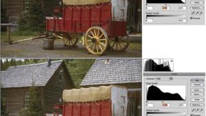
| Hi there, thanks for checking out Playing With Pixels. This time around we'll take a quick look at some of the cool tools in Adobe Photoshop that can help improve your images--and your image among your photo pals. Don't have Photoshop? Stay tuned anyway. Your computer-imaging program probably has some of the same tools. What's more, some tools (brightness, contrast, and saturation) may be available in desktop ink jet printer programs. Here we go. Crop. Simple as it sounds, using the Crop tool can make the difference between a great shot and a snapshot. When cropping, remember this tip: The name of the game is to fill the frame. In other words, crop out dull areas of a scene. Play with this tool. Try turning horizontal images into vertical shots, and vice versa. Brightness/Contrast. Spend lots of time with this control. You'll see how even slight adjustments in brightness and contrast can change a picture--for the better! Saturation. We live in a world where supersaturated films are the talk of the town, but try reducing the saturation in a picture for a more subdued effect. Then, boot up the saturation and make your pictures "pop" with color. Keep playing with this control until you are 100 percent happy with your image. Color Balance. Professional photographers use expensive color meters and correction filters to fine-tune the color in their pictures. Well, with the Color Balance control, you have all these tools at the tip of your fingers. Experiment until your heart's content. Dodge/Burn. Any photographer with experience in the traditional darkroom knows the value of dodging and burning, that is, using a hand or cutout to lighten or darken a part of a picture. Digital darkroom dodge/burn tools work the same way. Use these tools to adjust highlight and shadow areas in your pictures. Filters. In past columns, I've talked about using digital filters. Sure, you can overuse them to the point where your picture looks, well, silly. But if you have a vision--an artistic effect in mind--you can use filters to create your own works of art. My advice here is to break the rules! |
|
|
|
|
- Log in or register to post comments


