Better Portraits: Give Skin Tones a Beautiful Warm Glow in Lightroom (VIDEO)

One of the most important tasks when editing portrait photos is carefully adjusting the model's skin, so it looks as good as possible while retaining enough texture and other attributes for a realistic look. Typically, that means eliminating obvious blemishes and other imperfections like dry patches or oily spots.
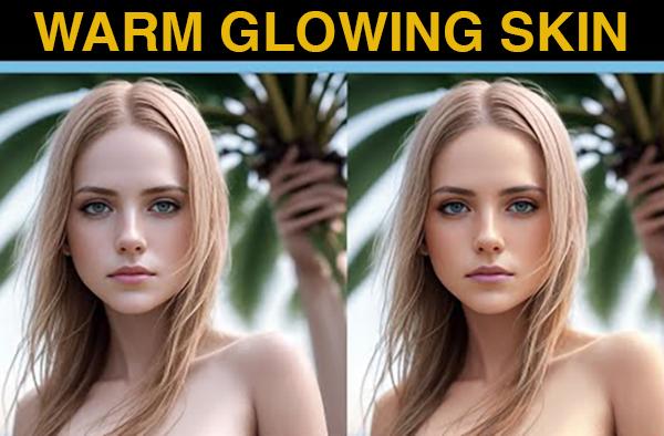
Today's Lightroom tutorial is a bit different because the pretty model has almost flawless skin. So, what's the problem? Well, some folks (and the model herself) might find her face a bit too pale for their liking. As you'll see in the six-minute below, this fix is a much easier enhancement than those mentioned above.
Image-editing expert Anthony Morganti is a favorite among Shutterbug readers because of his knack for simplifying common post-processing tasks. In this episode he demonstrates how to make a portrait more inviting by altering the tone of the subject's skin in a way that mimics a subtle, healthy tan.

Morganti notes that he usually limits his portrait editing to removing skin imperfections like those mentioned above. In fact, he says he's never changed the tint of a subject's skin, until he was recently asked to do so by a subject he photographed. He gave it a try and reveals a quick way to get the job done using the stock photo you see here.
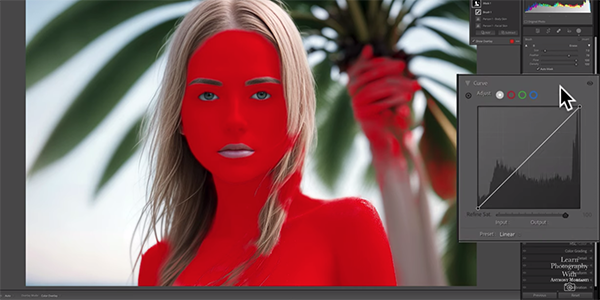
As you'll see, this method owes its simplicity to Lightroom's new Masking capabilities. After opening the Masking panel Morganti selects the People Mask and chooses both Facial Skin and Body Skin from the dropdown menu. By then clicking Create Mask, the simple transformation is underway.
If Lightroom misses part of the body (or face) as it did here, simply click the Add button near the top of the panel, making sure Auto Mask is turned on. Then it's a simple matter to use a brush to paint in whatever was missed. Morganti has some good advice for the best settings to use.

Once the Mask is ready it's time to make the skin-tone enhancement, which Morganti says is "super easy to." After watching him use Lightroom's Tone Curve tool, beginning with the blue curve, we think you'll agree. Morganti warns to be careful when moving on to the red curve because it's easy to overdo things when making this adjustment.
After watching this video, pay a visit to Morganti's popular YouTube channel where there's much more to learn.
We also suggest watching the tutorial we posted earlier, with a color-grading primer that explains several simple techniques for beginners.
- Log in or register to post comments


