Unlocking HDR; Examining Photoshop’s HDR Mode: Are There Better Ways To Deal With High Dynamic Range Images? Page 2
 |
 |
The Layer Blend Approach
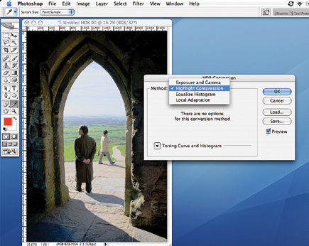
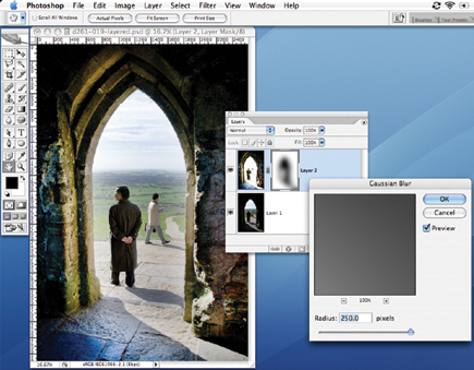
Here, our two "exposures" have been superimposed as layers in Photoshop,
with the "shadows" layer on top. The blown highlights in this top
layer are selected with the Magic Wand tool, and this selection is inverted
and converted into a layer mask. Now, the highlight detail preserved in the
lower layer shows through, though the edges of the mask will be too sharp, and
the "join" will look artificial. The solution is to apply a Gaussian
Blur to the layer mask. A value of 250 pixels gives a much subtler blend. Our
picture is still not quite right, though. It's possible to see that the
bright background hillside seen through the arch grows subtly lighter toward
the edges of the arch, and this is because the blurred layer mask now extends
into this area.
This effect may not be obvious, but if it is the solution it involves just one
extra step in the process. Once the initial selection is made with the Magic
Wand, use the Select>Modify>Expand command to expand the selection by,
say, 50 pixels before inverting it and creating the layer mask. Now, the "blend"
in the mask is shifted to overlap with the darker areas in the arch, where it
will be noticed less. The improvement in this version of the image is subtle,
but useful. (It's possible to see the layer mask is slightly larger and
denser as a result, too.)
 |
 |
The way this layered image is constructed provides a great deal of editing flexibility.
For example, we've been able to enhance the contrast of the background
hillside and the interior independently, with curves adjustments--remember,
they're on separate layers and the layer mask prevents adjustments in
one having an effect on the other. Also, the inside edge of the arch on the
left looked a little "dead." This is caused by the blurring of the
mask in that area. The solution was to paint out this part of the mask using
a small, soft brush (70 pixels) with the color set to white. This "brushed
away" the mask in that area so that the detail in the brighter "highlight"
layer became visible again. These manual touchups to the layer mask are a quick
way to iron out any remaining problem areas.
- Log in or register to post comments

