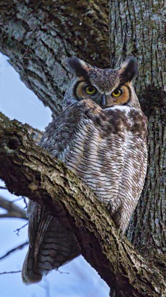
Innova Art FibaPrint Warm Cotton Gloss
Way back in 2006, Innova Art brought out their FibaPrint White Gloss 300 gsm, and while not what I’d call a big brand name here in the US, digital printmaking aficionados who had come from the fiber-paper darkroom tradition took note. Here was an inkjet paper that emulated, and some say matched, the look and feel of traditional bromide silver printing paper. Other surfaces have since been introduced in this line, including the new FibaPrint Warm Cotton Gloss 335gsm that’s the subject of this report. Of course, this is not the only paper that claims the “fine art” pedigree, but due to its weight, its ability to reproduce a wide range of tones with clarity, and its acid- and lignin-free constitution it has all the required specs.

According to Innova Art, the ultra smooth gloss surface of the paper is produced by their “crystal layer” technology, which creates a barrier layer between the fiber base and the microporous glossy coating. They also claim a D-max of 2.7, which means that deep blacks should reproduce with fidelity and character. Other specs of interest include the fact that the paper does not have Optical Brightening Agents (OBAs) incorporated, comes in rolls up to 60” and cut sheet in various sizes, prints with photo black inks, and that the profiles for it with numerous printers are available on the company’s website, www.innovaart.com.
Weight And Feeding
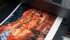
I started by first downloading the profile and installing it in the Profiles folder in my MacBook Pro. Because this paper is what I’d put in the light heavyweight class (as opposed to art board), printing with the Epson R3000 (and similar class printers) requires single feed through the front sheet loader. I would not attempt a stack load on any printer, although a cassette load on higher-end printers with appropriate platen adjustment would do fine. I chose a number of images to print, including color and monochrome, although I must confess that I went in seeing this paper as more apt for monochrome images.

All Photos © George Schaub
The first impressions of the paper are its warm base; then its weight, which is, in a word, substantial; and then its surface, which is a smooth gloss. The surface is not a hard sheen gloss, as you might see in RC papers, but rather a smooth gloss like that obtained when you dried a double-weight glossy fiber silver print face down. It handles the ink well and makes the image inclusive to the paper rather than “floating” on top, which can occur with some papers.
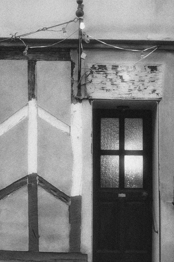
The lack of OBAs is laudable, but this has both pluses and minuses depending on what you might be accustomed to in printing papers. On the plus side, inclusion of OBAs in an “art” paper of this type seems like a contradiction; it usually is not done, and for good reason. But on the minus side, those who have been working with OBA-included papers might find the image backing a bit “dull.” Keep in mind that OBAs may fade over time due to exposure to UV, and that this may dull and yellow the print in the long term. At the end of the day the initial bright seduction of OBA papers to your eye might well be a passing fancy. (I must note that in terms of my own darkroom (silver) work, papers with OBAs printed on 20+ years back do show this drop-off, which one often attributes to poor hypo clearing but may well be the OBAs slipping away. In olden times OBA inclusion was a way to make up for manufacturers putting less silver in the emulsion—nowadays it’s a kind of brightener to make papers seem whiter than they might otherwise be.)

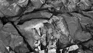
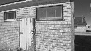
In any case, I ran the paper through the Epson R3000 with three profiles I usually use for testing—with Photoshop managing color, the company’s profile, and a generic Epson profile (here Glossy). I also used Epson’s Advanced B&W mode profile, neutral setting. As I have often found for monochrome prints with other “art” papers, the Epson generic and Advanced B&W produce very good results, although they produce somewhat more contrasty images than does the company profile. The Innova Art profile produced somewhat more open mid-tone values, although in some very deep grayscale tonal areas the generics produced somewhat richer blacks. Yet, in terms of a truly nuanced shadow, the grayscale was a bit more open using the Innova Art profile, so print for that and you won’t be unhappy.
This might seem like so much nitpicking in terms of deeper gray values, but in many prints this character is what separates a successful and expressive image from a mere reproduction. And of course this is image dependent. With some images you won’t see much of a difference, but for my money I’d stick pretty much with the Innova Art profile and play with curves as needed to attain deeper blacks when desired.

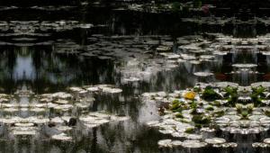
Color images were a different story. Because of the warm yellow base many color images start out with a bias, or at least a perceptual one when you view the image and the paper border together. Again, this is image dependent, but when I did a landscape print of a waterfall with a brilliant blue sky and flecks of green throughout a neutral cliff color, I was not thrilled with the results. I have printed this image on numerous papers and I always find that I prefer it on a cooler base. However, when making a print of fall colors reflected in a lake in Harriman Park, New York, the base and color of the image played exceedingly well together. Like I said, image dependent.
These are not “instant dry” papers, and it’s not that they will smudge but that inks have to set for a bit before boxing the print. There is little if any dry-down effect and what you get coming out of the printer is pretty much what it will look like after a certain amount of time. I usually keep my prints open to the air 24 hours prior to boxing anyway. Oh, and these are prints you can sign on the back using a pencil, unlike supports on some other papers. (Only flat matte surfaces allow you to sign the margins on the front with pencil.)
All in all this is a very good addition to any printmaker’s paper selection drawer, one that brings a good weight, pleasant surface, and archival characteristics into play. It builds on Innova Art’s rep, and is an excellent choice when a warm-tone paper is desired. The cost of papers such as this is not cheap. The MSRP of a 25-sheet box of 13x19” paper is $119, making it a bit over $4.70 per sheet, although researching websites might help lower that, but I guess that’s the price you pay for this quality and character. In short, this isn’t for proofing or learning the printing craft—it’s for those going for the wall or the portfolio who know what they want and will not waste too much paper in attaining it.
For more information, contact Innova Digital Art at: www.innovaart.com.
- Log in or register to post comments
