How I Opened My Own Photo Gallery (And Lived to Tell the Tale!)
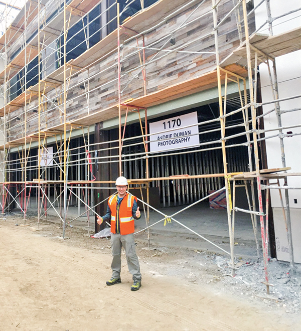
I wake up in the middle of the night in a frazzled state. “Did I lock the front door of the gallery and did I turn off the base lights of the trees on my way out?” I was replaying the night’s events in my mind to ease my worries but I am so tired that it is all a blur. I am not sure when I decided to open up my own photo gallery and in some ways I am not really sure why I wanted to do it either.
Opening the gallery has been stressful, financially crippling, and emotionally draining, yet it has been one of the most rewarding experiences of my life. I wouldn’t change it for anything. Here’s how I did it.


How It Began
I am a 34-year-old adventure seeker, born and raised in Romania, who eventually ended up settling in the United Kingdom and becoming an investment banker. Throughout my professional life, I have been fortunate enough to travel to over 70 countries, always on the lookout for the unique and remote destinations. It was my escape.
With all my business trips, I took a lot of photos with increasingly more complex and expensive equipment. However, until very recently, no one had really seen my images. In some ways, they were taken for my own fulfillment, but deep down I never thought they were good enough.
After having already amassed a huge collection of images from my travels, I made an abrupt U-turn and decided to consult with some of my photography colleagues on what I could do to showcase it. On their advice, I moved to Los Angeles and decided to apply for some open curator events at larger galleries in the city. My work was met with unexpected acclaim. With a perplexed, anxiety-ridden confidence, I concluded that my photos were potentially varied and strong enough to possibly make the idea of opening my own gallery a success.
I laid out a rough plan of what I thought the steps would be to at least get the project going: find a lawyer, find a location, and then find an architect. I needed help, as I was still working a full-time job in finance. One of my very good friends and fellow photographer, Wendy Hudnall, came on board to ease the burden of the planning and build-out schematics.

Location, Location, Location
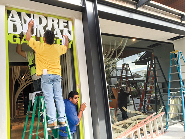
One of the biggest issues was finding the right location and many hours were spent driving around Los Angeles looking at not only main street locations but also existing and soon-to-be constructed high-end shopping malls. I was more drawn to the idea of being in a luxury mall as that would naturally bring the foot traffic to me rather than me having to rely on the flow of people on the street, which depending on the location could be very hit or miss.
A few times I nearly signed for a location then it mysteriously fell through. It was my personal feeling that developers were cautious of having a photography gallery in their malls as it is too risky so they always settled for a Verizon or Lululemon store. It was a trying and stressful time indeed as I really wanted to get this project off the ground and allow it to grow some roots (terrible pun but will make sense later…).
It was by pure chance that the space I currently occupy came to me. It was presented to me that Westfield Development was in advanced construction to expand the Topanga Mall in Woodland Hills, by building an outdoor mall called The Village. It was to be the family-friendly shopping location with over 15 restaurants and many other boutique stores, greatly complimenting the more high-end Topanga Mall that houses Tiffany, Ferragamo, and Gucci. There were not many spaces available. However, by luck, Westfield decided to split one of the larger stores located by the main square into two separate lots. Many lawyer meetings later, the location was mine, a 1,500-square-foot rectangle of potential gallery space. It was to be my great experiment.

A Unique Design
It was crucial to have the interior look and feel of the space visualized in order to pitch it to Westfield. By pure chance the architect (Relativity Architects) I found shared the same vision to help make the gallery a reality. They were very supportive of the gallery idea and after many discussions were able to present four separate designs that supported my creative plan. I always wanted the space to be kept modern, with little to distract from the images themselves, and I believe their designs achieved that brilliantly.
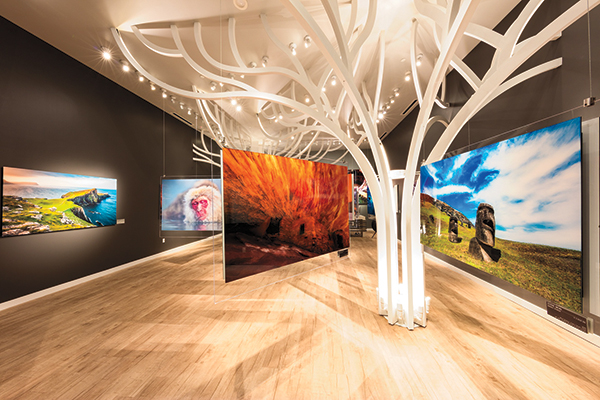
It was during a meeting on Sunset Boulevard that the entire course of the project changed. One of the proposed designs was so unique and captivating that it was impossible to turn down. Their design revolved around using casted trees and having the branches strategically placed so that the prints themselves hang at different heights. Each branch would have a steel core wrapped in wood that would be painted white to sharply contrast the dark gray walls.
This design would also end up providing cover for the main supporting beam of the store as the branches are springing upward and essentially engulfing it, further adding to the continuity of the tree design. It was to be a design like no other. The artwork is suspended from the branches using metallic cables, which clasp custom-made Plexiglas that has built-in cleats, allowing for the images to easily attach. The advantage is that the Plexiglas and cables are strong enough to hang one print on either side, thus eliminating the worry of the back of the pieces being exposed. They also provide the sense of the pieces floating in midair.
Not only is this a unique way to showcase the works but it also allowed me to more than double the number of images that I can display at one time. Given the relatively small space of the gallery, the design has given me the freedom to eliminate the need to place fake dividing walls which would have drastically reduced the open space and modern feel of the interior. It is unlike anything that has ever been achieved before and was quite an architectural struggle to say the least.

Unexpected Challenges
Everything was going well. The design was in place, the lease was signed, the budget was finalized. It was about this time that everything pretty much started going downhill…quickly! The following months turned into a steady and ever-increasingly steep decline. Seeing that the mall was in construction, the developer provided me with an allowance to build out the space. Sounds fantastic, however I must stress that all I started with was a ceiling and a concrete floor. The walls were not up, there was not even any drywall, no electrical wiring, no vents installed, no sprinklers, no fire alarm…literally just an empty box.
As one can imagine, this brought up a lot of issues. First, before I could even secure a General Contractor (GC), I found out that I could only use union labor for the carpentry build out. This increased the cost significantly. In fact, let’s not shy away from it; it more than doubled my initial budget. As a result of the union labor requirement, I found it hard to secure any GCs that wanted to take the job on. It simply put many of them off and I was left with two and a half months until opening but no one to build for me.
After many negotiations and five GCs walking away at the proposal stage, I started to panic. This was compounded by the developer constantly asking me when construction would start and reminding me that I would be fined if I was not ready on mall opening. A GC was finally found and work swiftly began. I discovered very quickly that every single item, job, second, cost money, and a lot of it at that. You want to move this to over there, OK that’s $750; you’d like to move the faucet a little to the left, $575; get a different door knob, $375 just for labor. In fact, to give you an idea of the costs involved let’s explore a little more shall we:
Drywall and Insulation: $62,000
Electrical: $51,000
Installing the Fire Alarm: $5,500
City Permits: Over $2,500
Duct Cleaning Inspector Requirement: $2,450
Roof Allowance: $1,975
Upgrading Storefront to 1/2-inch Glass: $1,800
Sprinkler Drain: $1,575
The list can go on for quite some time but it would be boring and it would just bring back that sinking feeling that I have been trying to escape. I even had to pay a city inspector to come out and inspect that the inspection was done! Let’s just say that it was a tremendous financial and emotional effort.
From what I am hearing, it is quite rare to have a gallery that is self-sponsored. Most have some financial backer and now I understand why. It allows for one to focus on the works and the layout rather than dealing with calls about yet another thing that has gone wrong or another bill that needs paying. It felt like every other day another thing had to be added that was not on the initial spec sheet: a vent on the roof had to be covered, the emergency lights had to be relocated as they were not to spec, a mega tester had to be completed to make sure that the electricity was working throughout the mall…all at my expense.
It was a horrible, demoralizing process, and many times I did question what I was doing and why. I felt guilty dragging my wife into this project and I was a nervous wreck. I felt that all I was doing was depleting our savings. I recall thinking of all the negative things and how it felt as though this project would never get done.
What if this is a disaster? What if people hate my work? What if I have to close the store within a few months as I am not selling anything? Coupled with the fact that I was still working a full-time job, I would have to sneak out to check on construction or to get on a conference call to put out a fire. It felt like I was on a roller coaster that was not stopping and that we were in build-out mode for many months when it was only about eight weeks.
The Opening
Somehow we miraculously opened on time. The gallery was not fully complete; some items were missing such as the main desk that was not cut in time, the back wall did not have the wood façade in place, and the display walls were not painted completely. Most crucially, the day before officially opening, two separate cables supporting the Plexiglas snapped and the plates fell and smashed. Because of this, the flooring was also damaged and needed immediate replacing at an additional high cost. Three prints were damaged, so I had to open without a full showing and had to buy a thicker cable and sturdier clasp system.
I was nervous about the opening and how people would react but the overall sentiment has been very positive. People are first drawn to the architectural intricacy of the trees and then their eyes gaze upon the images themselves. They are impressed with the variety of the locations and the unique subjects, which I am sure few people have seen before. A few days turn into weeks, weeks into months and things settle down.
I have found that while 99.9 percent of people are very interested and welcoming to having the arts back in the San Fernando Valley, there is always that very small percentage who only want to make you feel bad. My staff and I have been confronted by some visitors who aggressively accuse my work of being over Photoshopped (something that every photographer has probably been told), and that they could take better images with their iPhones. They don’t understand why a photo could cost so much and I think that there is a general lack of understanding of what it really means to be a photographer: the travel, the expensive equipment, the dedication to the shot and what it takes to get it, the post work, the time put in with the master printer.
When you buy something from an artist, you are buying hundreds of hours of mistakes, experimentation, and evolution to master their craft. You are buying countless hours of frustration and quiet moments of joy when it all comes together. What you are really buying is a small piece of someone else’s life. With the boom of very good quality and cheap DSLRs, I feel that the art of being a professional photographer has lost that mastery status. Due to the possibility of a reprint and the usually high edition sizes, I think people have a skewed perception of what it entails to be a photographer with a gallery and all the overhead that comes with that.
Was It Worth It? Yes!
When I initially presented the idea to others that I wanted to open up a gallery, I was told that it is career suicide. It is a dying breed of establishments in which it is nearly impossible to break even, let alone make a living.
Many questioned what I was trying to prove. Some competing galleries started telling me how badly they were doing. While the process has been full of disagreements, finger-pointing, delays, and spiraling costs, in the end, this is my gallery. I feel proud that this is my space and the unique architectural aspect compliments my work effortlessly.
While I do know that this will be a long road and I am not sure what I will find at the other end, I am a firm believer in what I am doing. And what exactly is that? My main purpose is to bring some of the most remote and visually stunning locations, events, and people to others who will most likely never go visit them.
I want to continue creating and inspiring others so that it will hopefully change some mindsets in regards to where one chooses to go on their next vacation and pushes them to see beyond what is comfortable. The world is an amazing place and I think we all need to step outside our comfort zones to explore it more openly. The motto at my gallery is: “Travel is the only thing you buy that makes you richer.” I try to live by that statement on all my adventures and I hope others will, too.
Andrei Duman is a Los Angeles-based photographer specializing in landscape, aerial, and travel. He was born in Romania, raised and educated in England, and lived for several years in New York before landing in L.A. You can see more of his work at andreiduman.com. You can also turn to page 14 to see his work featured in Full Frame.
- Log in or register to post comments

