- REVIEWS
Camera Reviews 
More Reviews Mobile Reviews Photography Reviews - GALLERIES
- VIDEOS
- BUYER'S GUIDES
On The Road: Killer Color: Bringing It Back Alive
Often people will ask me, “How do you get that great color in your photos?” I appreciate the compliment, but it’s usually followed by, “You must do a lot of retouching.” Actually I don’t. I will do a little color enhancement, but how color looks in my images has to do partly with how I set certain camera controls, how I control or use lighting in the scene, and how I compose the photograph.

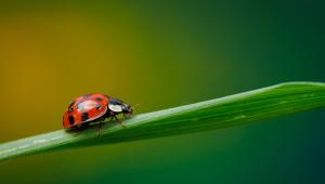
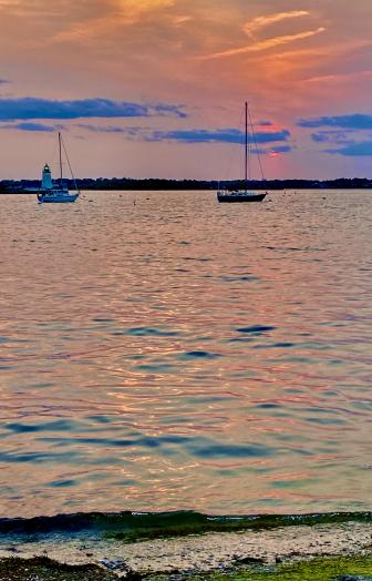
All Photos © Maynard Switzer
My camera setup starts with white balance. I think most people just shoot on the auto white balance setting and make adjustments in postproduction. I choose auto white balance about half the time, but for the rest I change the white balance to suit the circumstances and the look I want to give the photo. I adjust so I can get the color the way it looks to my eye as I’m shooting. I don’t want to do a lot of work later, and I don’t want to try to remember or approximate how I think the color looked in the scene.
Auto white balance works well enough for fairly standard settings, but on a cloudy day or in the shade or at high altitudes, the auto setting will likely result in photos that are very blue and pictures I’m going to have to work on later. I like to choose the cloudy setting from the camera’s menu to warm the scene a bit right at the start. Frankly, I like my photos on the warm side. Cool colors can be calming and restful, but warm colors are more powerful and inviting.

Often I’ll make a custom adjustment to the white balance—that is, I’ll go into the menu and set a specific color temperature for a scene—a finer adjustment, one that’s more specific to what the scene looks like or what I want it to look like.
I think the best thing you can do is experiment with your camera in different situations so you’ll know how it will react as far as white balance is concerned, and how you can get the look you want. All cameras, even within the same brand’s different lines and models, will work slightly differently.
In addition to white balance settings, many cameras offer picture controls or picture styles. I use the vivid setting most of the time, the standard setting the rest, and I always turn down contrast and sharpening on those settings. Those are two areas I prefer to adjust in post-processing as very often my subjects are contrasty to start with, and if I push the contrast I’ll start to lose detail in the shadow areas. And if sharpening is too high I’ll start to pick up the dreaded artifact effect.

I’ll definitely use the histogram with exposure compensation to make sure I’m not clipping the highlights and losing detail in the lightest areas and washing out the drama of shadows and brilliant colors. The histogram tells me right away if I’m lessening the impact of my images.
Lighting obviously affects how color is going to look in the photo. If you’re shooting fall leaves in direct sun they’ll look very bright, very red, but if you have backlighting, they’ll look luminous and dramatic, though less saturated. Sidelighting makes colors look more vibrant and saturated; the golden hours are golden exactly for that intense, warm look. If the light isn’t giving me the color I want, I’ll try changing position, adding a flash, or, because color is really that important, coming back at a different time of day. If I have to shoot in the middle of the day when the light’s very harsh, I’ll deliberately emphasize the harshness by exposing strictly for the vibrant color and let the shadows go deep.

I’ll use center-weighted or spot metering to read, say, a brightly colored wall. I don’t want the meter to turn that wall into a medium tone; I want that hard, bright color captured, not averaged out.
Finally, I’ll use composition to emphasize color and to make the most of what the color in a scene is giving me. If I can, I make color the subject and place it so that it’s the main attraction. I’ll fill the frame with it and do everything I can to eliminate a distracting background.
far as the accuracy of the LCD when it comes to evaluating what kind of color tones I’m getting, I’d say it’s reasonably accurate, enough to give me a good estimation of where I am. But what’s most important is experience: I know how my cameras see and capture a scene. And then when I’m downloading at the end of the day, I can see what I’ve been getting and find out if any adjustments are needed.

I said, color is that important.
Maynard Switzer’s website, www.maynardswitzer.com, features several portfolios of his travel images.


![]()
Get the Latest Photo Tips, News & Reviews from Shutterbug!
| Camera Reviews Other Reviews | Mobile Reviews Photography Reviews Columns | News | Features | How-To | Resources |
 © 2025 Shutterbug
AVTech Media Americas Inc., USA
All rights reserved