The New Art Of Photographing Nature: An Update On A Classic By A Master Photographer
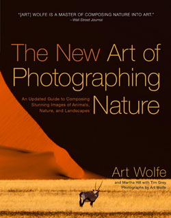
The New Art of Photographing Nature: An Updated Guide to Composing Stunning Images of Animals, Nature, and Landscapes (Amphoto Books, $29.99) is from world-renowned photographer Art Wolfe and writer and photo editor Martha Hill, with Tim Grey. In this revised edition, the text has been updated throughout to reflect the dramatic changes in photography since this classic was first released in 1993. More than 50% of the beautiful images are all new, and a new contributor, digital imaging expert Tim Grey, shares sidebars throughout offering tips on digital imaging and processing.
Continuing the lively dialogue that made the original edition a bestseller, Art Wolfe and former Audubon photo editor Martha Hill share insights and techniques about composing better nature images. Art discusses the creative process behind his compositions, while Martha talks about the images from a photo editor’s perspective. The two compare photos that work well with some that don’t, and they discuss why. The result is an engaging read that is informative, inspiring, and entertaining. Combined with Tim Grey’s expert tips on digital imaging, the book touches on all aspects of technology and artistry for nature photography enthusiasts.
Featuring 250 of Art Wolfe’s gorgeous images of nature and wildlife, The New Art of Photographing Nature is sure to inspire photographers to see more creatively, enhance their compositions, and take the most stunning nature shots possible.
—Liner notes supplied by publisher.
Primary Colors
Audubon once published a series of essays about color in nature that started with red because it is a favorite eye-catching color for editorial and advertising use. Thirty-six images were selected from several thousand submitted. The “red” essay proved so popular that it was followed by “blue,” and then “yellow.”
Some of the examples were the obvious—red maple trees in fall, a bluebird, a yellow daisy. But most were much less familiar—the red mouths of baby cuckoos, the yellow cere on the face of a Harris’s hawk, the turquoise eyes of a baby cougar. When you think about it, life without color would be dull indeed. So much of the pleasure we experience in our surroundings is tied to the variety and abundance of color.

70–200mm lens, f/9 for 1/20 sec., ISO 100
All Photos © Art Wolfe Inc.
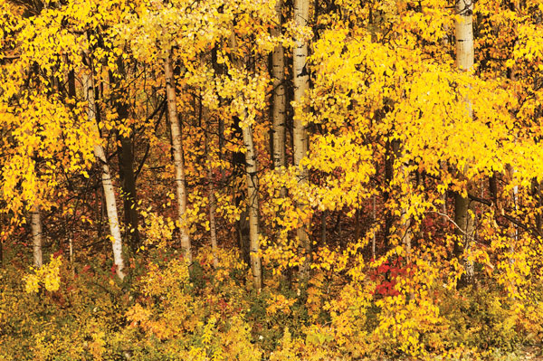
24–70mm lens, f/11 for 1/4 sec., ISO 50

70–200mm F2.8 lens, f/18 for 1/400 sec., ISO 400
Portfolio Of Complementary Colors
Artists have long known to use colors based on their relationships to one another. On the color wheel of primary and secondary colors, those opposite each other are called complementary—red and green, orange and blue, yellow and purple—because they have an unusual optical effect on us. When used next to each other, each complement vibrates more intensely.
The nineteenth-century French impressionists were the first painters to exploit this phenomenon. It is no different for photographers: the bright red cock-of-the-rock, for example, will stand out much better against the backdrop of green foliage than that of a pale blue sky.

400mm F4 lens with 2x teleconverter, f/8 for 1/4 sec., ISO 500
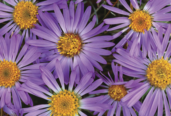
70–200mm, f/16 for 1/8 sec., Fujichrome Velvia 50
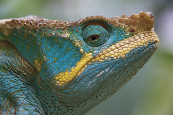
70–200mm lens, f/5.6 for 1/50 sec., ISO 400
Portfolio Of Related Or Harmonious Colors
Harmonious colors are those that are related in hue or are next to each other on the color wheel—yellow, green, and blue, for example, or pink, orange, and yellow. Because of this, they tend to make a different kind of statement, less bold when placed side by side than complements, yet very appealing to look at. Certain seasons are characterized by harmonious colors, such as fall, with its reds, browns, oranges, and yellows.
Editors take color into consideration when selecting their magazine covers. Audubon’s bestselling cover was a fairly somber fall foliage shot of a gray-phase screech owl; what made the picture were the tiny orange berries left on a vine. As images to frame and hang on the wall, harmonious color schemes are soothing, like the subtle earth colors in the aerial of the Ord River. They wear better over time when they have to be looked at and lived with every day.

70–200mm lens, f/4 for 1/640 sec., ISO 100

50mm macro lens, f/11 for 1/8 sec., Fujichrome 100
Portfolio Of Pastel Colors
Pastel colors can be thought of as simply muted versions of primary and secondary colors, with the same relationships still applying. They are often associated with spring, a season of pinks, lavenders, pale yellows, and greens—the colors of emergent vegetation. But they are also associated with winter, as in the image of the firs on Mount Rainier (below, left). The image of the Bolivian salt hills (below, right) with their soft pinks and blues also resembles a winter landscape.
The prismatic effect of abalone shell produces pastels in the whole color spectrum, satisfying and fascinating as they change according to the angle of the light. Like harmonious colors, pastels are emotionally pleasing and have a quieter impact, making them soothing, and therefore easy to live with.
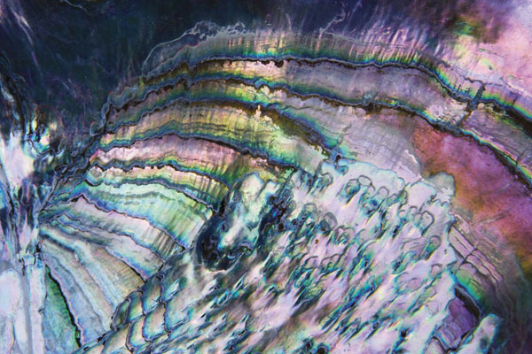
24–70mm lens, f/22 for .4 sec., ISO 100

80–200mm lens, f/16 for 1/8 sec., Fujichrome Velvia 50
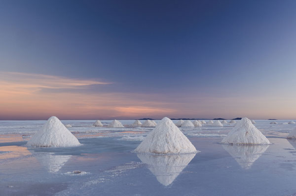
24–70mm lens, f/22 for 1.3 seconds, ISO 100
 Where To Buy
The New Art of Photographing Nature: An Updated Guide to Composing Stunning Images of Animals, Nature, and Landscapes (ISBN: 978-0-7704-3315-4, $29.99) by Art Wolfe and Martha Hill, with Tim Grey, is available through online booksellers and better bookstores.
About The Authors
Art Wolfe’s stunning images are recognized throughoutthe world for their mastery of color, composition, and perspective. Wolfe’s television series, Art Wolfe’s Travels to the Edge, airs on PBS stations throughout the country. He is also a popular speaker for such companies as Microsoft, IBM, and Sheraton Hotels. He can be found at artwolfe.com as well as on Facebook and Twitter. Wolfe’s new book, The Art of the Photograph: Essential Habits for Stronger Composition will be released on December 3, 2013.
Martha Hill is a freelance writer and the former photo editor of Audubon magazine.
Tim Grey is regarded as one of the top educators in digital imaging, having written more than a dozen books and hundreds of articles. He can be found at timgrey.com.
- Log in or register to post comments


