Get Great Studio Portraits
Nine Tips To Lighting Success

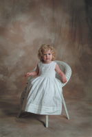
This photo of Molly Olson shows the wraparound effect of the form fill combined with the main light. The main light is a Photogenic Powerlight shot through a Studio Dynamics 36" round softbox. The fill is a Bogen Bo Lite with a white umbrella. The background light is very subtle, adding light to the left side. Notice how your eye goes from the light background to the dark shadows to the highlight side of the face and then back to a darker background. Background by David Maheu.
Photos © 2003, Steve Bedell, All Rights Reserved

My strong point has always been natural light. When clients call me about weddings, I tell them I am a "natural light specialist." I love shooting outdoor portraits and have trained myself to "see the light" in the locations that I visit. But that does not mean I don't shoot in the studio. Living in northern New England, just shooting outside would severely limit the number of sessions I could handle. Not many people go for outdoor portraits when the temperature is below 10 degrees F.
I have made a concerted effort to elevate the quality of my studio portraits over the last year. I've completely overhauled my lighting system as a result of several seminars, including a three-day stint with Tim Kelley of Orlando whom I've written about in these pages, and my own practice. A big plus is the fact that I now shoot everything except family groups digitally, allowing me instant feedback and the ability to make rapid changes. Following are some tips that I'd like to share.

Form Fill Light
Use a form fill light, which might just make the biggest difference in your work. In the "old days," which I call BD (Before Digital), photographers would usually design their studios with a bank of lights bouncing off a back wall to flood the studio with a non-directional fill light. They would then adjust power to get whatever f/stop they desired at the subject distance, and never touch it again. Most would usually base their exposure on this setup. The thought was that even if no other lights fired, you'd have a good, printable exposure. But it also has the effect of evenly lighting the entire subject with a very flat light. Trying to do profiles was an exercise in futility without changing the fill light.

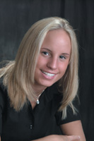
This photo of Ashley Dubois looks like the light is flatter. Why? Because when I want a more even look to the lighting, I simply move my fill light to the side opposite the main light. Since I've metered my lights precisely, I keep my exposure the same but the shadows are "filled" more.

A form fill, on the other hand, works in concert with the main or key light to create shape to the subject. The form fill should follow the nose. Using the profile example again, if your subject is facing the wall to your right, the fill light should be placed in front of the wall he or she is looking at, not behind you. The main light will be slightly behind the subject to create the shape you want, and the form fill will help shadow detail without destroying the effect you're trying to get. Even in traditional poses, with the face toward the camera and the head turned slightly, you'll notice your portraits have much more "snap" by placing the main and fill on the same side of the camera.

Meter Ratios
Meter ratios precisely. Since I've gone digital, I have not thrown away my light meter like some pros. I now use it more than ever! By using one incident meter that I know like the back of my hand I can overcome variables such as dark and light colors and the difference between lenses and their readings. When I set my studio up, I meter each light individually. I start with the main light and base everything else on that. I like my main to be f/11, and my fill to be f/8. My background light will vary between f/8 and f/11 depending on the color of the background and how bright I want it to be. My separation or hair light will vary between f/8 and f/11 also, depending on the subject's hair color. By metering your lights first and then making final adjustments, you know you'll be within tight tolerances, especially for digital.


Feather The Main
Feather your main light. There are a couple of reasons for this. First, by this point you can see that each light has its job to do and you want them to act in harmony, as opposed to defeating each other. By feathering the main light, you allow light to strike the subject but not the background, which you want to control independently. (The term "feathering" means you turn your main light toward the camera until just the front edge of the light hits your subject.)

But there is another vital reason. By using just the front edge of the light to strike your subject, the rest of the light is acting as a "form fill." The light coming from the opposite side of your main light is helping to fill in shadows and create a smooth transition from highlight to shadow area. How much depends on the relative size of the light in relation to your subject. Many photographers use 6-foot long and larger softboxes up close to their subjects. By feathering a light that size, the one light is both the main and fill, so no additional fill light is needed. Smaller light sources will create sharper shadows--you need to do your own testing to see what suits your style.

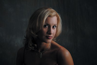
In this portrait of Kelsey Call, I wanted to create a dramatic effect with a dark background and dark clothing. Notice how the separation light adds life to the hair. The hair showing back and left would have disappeared into the background without additional light.

Watch The Background
Keep light off the background. As you may have already surmised, each light has a distinct purpose and interference from other lights will destroy its mission. In addition to feathering the main light to keep it from striking the background, you should also make sure that your hair or separation light does not strike the background. I've seen many portraits ruined because a photographer allowed his hairlight to strike the background. Make sure it is "flagged off" properly. Do this by turning off the room lights in your studio and checking each light one at a time in the darkroom, noting the lighting pattern of each light.

Go For A Gobo
Use a "gobo." Talk about a blast from the past! A look at most photographers' studios will find a collection of softboxes and umbrellas of ever-increasing sizes. While we've all learned that "size matters" when it comes to light modifiers, that doesn't mean we can just aim a huge light source at the subject and get great light. We can be sure we'll get a bunch of it, but there may be areas where "less is more." Enter the gobo, a "go between," in this case something placed between the light and the subject to block light. You can also use a gobo to block light from striking your lens.

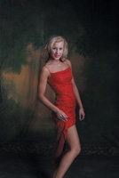
In this photo of Shauna Randall, I wanted to add a little color to the background, so I added a red gel to my background light. If my main light was not feathered away from the background the intensity and saturation of the red would be lost.

While you can buy them, all you need is a reflector or piece of cardboard placed on a light stand. By blocking off certain areas like a bare shoulder or baldhead, our attention is kept on the face. I suppose you could do it in Photoshop later, but why not do it before so all the photos look good, not just the ordered ones? I still try to shoot like Photoshop does not exist. Try it--you'll be a better photographer.

This dramatic portrait of Shauna Randall was created by using a form fill, main light, just a touch of light on the background, and a gobo. By blocking the light on the shoulder, the attention stays on the face. No separation light was used because of the bare shoulders.

Separation Light
Use a separation light. This used to be called a hairlight, but when used properly the term separation is a better fit. This light is placed above and slightly behind the subject and is usually aimed at the hair. Its purpose is to provide detail in the hair and to separate the subject from the background, as a rim light does outside. This light should hit the shoulders also. Pay careful attention to the intensity of this light. Too much and it becomes distracting and can cause overexposure; too little and it becomes unnoticed. I usually like to have mine right between the fill and main light intensity (f/9.5 in my case) and will go to f/11 for very dark hair and f/8 for very light hair. I turn it off for baldheads. This may sound obvious, but I see photos all the time of baldheaded guys with a big shiny spot on their head. Unless you're going for a "kicker" effect, leave it alone.

Notice how in this example of Shauna Randall I've directed the background light to the left side and the main light is from the right. Try to picture how the image would look with the light to the right. Instead of a nice balance, all the "weight" would be on the right side of the photo with no interest in the left-hand side. Background by David Maheu.

The Shadow Side
Light the background from the shadow side. Most photographers still use a short background stand with a light perched on it and a half moon-type reflector on it that shines light on the background and keeps it from striking the subject.

Try this instead. Take your background light, put it on a stand, flag it off so it creates a spotlight effect, and aim it at the background from a few feet away. By creating a lighter area on the shadow side of the portrait you create balance by using a light-dark-light pattern in the image. The effect should be subtle, not overpowering. Start by having the background light intensity about the same as the fill and increase it for dark backgrounds. You'll see it has a much more elegant look than just smashing a light at the background.


Highlight Bias
Base your exposure on the highlights. If you're shooting film you can still get away with the old method of basing the exposure on the fill light. Try it with digital and your images will be toast. I base my exposures on the intensity of my main light and use the fill to add detail to shadow areas. Digital capture has an exposure latitude of close to zero, maybe 1/3 stop either way. You've got complete control in the studio, so do your testing first and there should be no reason why you shouldn't have perfect exposures every time. I don't bother shooting in "raw" format. I've tried it and find I don't want to change anything, so I've given myself more work for no real reason. I realize some cameras don't give you this option.

Here's what the histogram of a properly exposed gray card looks like and this is what you should see on your LCD back on your camera if you've exposed properly.

Gray Card Test
Shoot a gray card. There have been many articles on this method of obtaining perfect exposure. Just fill your image with a gray card under your studio lighting conditions and look at the histogram. Since it's just that one color and it's a perfect medium density, your histogram should just have one spike exactly in the center. What a great idea! There are also cards and reflectors floating around that are divided into three colors--pure black, gray, and pure white. Take a picture of these and you should have three spikes lined up perfectly. (Frank Criccio is credited with this method.) If they're off to one side or the other, adjust your exposure to correct.

And One For The Road
Hey, I said nine tips! For some reason, people like to have things in nice round numbers, so here's a little bonus. Try using a "kicker" light for impact. A "kicker" is usually a strong light used to accent a feature or add drama to a portrait. How about we leave that subject for another article down the line?
Note: All images in this article were captured with a Fujifilm S2 Professional camera. They were shot in Fine JPEG mode with no sharpening or contrast boost (ORG settings). These are totally unretouched files taken with auto white balance.

X