The Darkroom
Nightmare Negs

The Darkroom

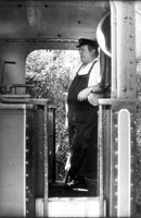
The Engine Driver. Determining the correct exposure for a subject in shadow on a bright sunny day is quite difficult--and printing it can be even more difficult. I used Ilford XP2 Super, rated at EI 250, and metered with my Voigtländer Bessa-T. Normally I would use a spot meter for this sort of situation, but I had mislaid it. The light in the cab of the engine was at least four stops down from the light outside. I took the meter reading in the shadow of the engine to give me some indication of how much I needed to increase the exposure, but I went a little too far. I got very dense negatives, but lots of detail.
Photos © 2002 Frances E. Schultz, All Rights Reserved

Everyone gets them: negs that just won't print. Sometimes, you can see why: they are hopelessly thin; far too contrasty; or flat and muddy. At other times, they look fine. You can have plenty of detail, just the right contrast, and still not get a good print.

The possible causes of nightmare negs are endless. The subject itself can be difficult. Imagine a misty day with a very short brightness range, or a contrasty subject under strong lighting. Some people call this sort of problem "subject failure," which is a wonderful concept when you stop to think about it. Or you can try a film or a developer that doesn't work out the way you had hoped. Or you can simply make a mistake: maybe the doorbell rang when you were developing the film, or you exposed the negative at the end of a long day and just plain got it wrong.

The most important thing with nightmare negs is to decide whether you should bother to print them at all. Certainly some are precious: the only picture of an ancestor, the first shot of a new baby, or a landscape from your once-in-a-lifetime vacation. But if the negative is something which can be shot again without too much effort or expense, go and make a new one.

Rethinking Paper Grades
Assuming this isn't an option, the first thing to do is to get rid of your preconceptions about paper grades. More than once, I have made really good prints from really bad negatives by going to Grade 5--and graded paper at that, because Grade 5 graded is harder than Grade 5 on variable contrast. (For the technically minded, ISO(R) 35-40 instead of ISO(R) 40-45.) Other times, I've had to go to 00--and here, of course, the variable contrast papers are softer. Prints from overly-contrasty negatives on ultra-soft paper are rarely as successful as prints from thin, flat negatives on ultra-hard paper, but you can still make a perfectly acceptable print, most of the time.

This shot where I was closer to the driver is the better exposure. The negative is not quite as dense, and the tonality of the mid tones is better. Both shots required exposures of over a minute to get good prints. My initial test strips were on Ilford Multigrade Warmtone, and the best exposure was over two minutes. I switched to Ilford Multigrade Cooltone paper which is the fastest paper I normally use, and this meant I could cut the exposure by about half.

Try Different Papers
Second, don't be irrationally loyal to one paper. If a negative won't print on your usual paper, use another (good) paper. I say "(good)" because there are some really bad papers about. I have seen some awful "own brand" papers: flat, lifeless, with a poor maximum density. They might work with some negatives and some subjects, but you will do a lot better to switch to another reputable brand. I have to admit, though, that if I couldn't get a decent print on the third or fourth kind of paper I tried, I would start asking myself how badly I needed the picture.

Matching Paper And Film
The reason for trying different papers is that each paper has its own unique characteristic curve, and so does each film. If the curves are well matched, the negative prints well on the paper. If they are not well matched, you may have problems.

A lot depends, too, on where the important tones are on the characteristic curve of the negative. One of the most dramatic examples I found was a photograph I took in Teror, Gran Canaria, on Ilford XP1. At the time my regular paper was Ilford Multigrade III, which normally worked fine with that film. But I couldn't get a good print, no matter how hard I tried. Fortunately, I had some Sterling RC VC and I decided to try that. The dark mid tones opened magically. That is because the characteristic curve of the Sterling paper had more of a "belly" than the Ilford paper, and the tones I was missing in the Multigrade III prints fell on that "belly."

Fountain and courtyard in Teror (Gran Canaria). This negative looks perfectly all right, but it is hard to print on some papers. When I first printed it, I used Ilford Multigrade III and I could not get the detail in the fountain. I switched to Sterling and the difference was magical.

Check Your Paper Developer
Try changing developers, too. Inexplicably flat, muddy prints from negatives that look good can often be traced to exhausted print developer. An obvious point, but worth remembering. Some developers are faster working than others, too, and deliver more or less contrast. Are you sure that you are developing for the full time at the temperature you are using? "Snatching" the print before it is fully developed will give poor tonality and weak blacks.

Slow It Down
OK: you've tried four papers and three developers, and things still aren't going right. Maybe it's a different kind of problem. Maybe you are in too much of a hurry. Making test strips is time consuming, too, but it will save you time (and frustration) in the long run. Test for both exposure and contrast: do it properly.

As for dense negs that seem to take forever to print, if the negative is one that you like, it's worth the time. Long printing exposures can even be an advantage if you need to lighten local details (dodging). You have more time to make sure you get it right. Consider, too, switching to a faster paper: Ilford Cooltone is about twice as fast as Ilford Warmtone.

Tibetan Wedding Guest. This negative is very thin and nderexposed. I was tired and ill because I had had Delhi Belly most of the day, and this also made me shakier than usual. This image was by far the sharpest on the whole role of film. However, by printing on Ilfobrom Grade 5 paper, I got an acceptable print, even at 8x10".

Try Another Size
Not all nightmares have to do with exposure and contrast, though. A negative that is unsharp because of camera shake, or that has an ugly, mushy grain structure, won't be improved by changing paper or developer. But it will be improved by printing smaller, because the faults won't be magnified as much. A small print, if it is well composed and tonally attractive, can have just as much impact as a big one. In fact, this is true for most nightmare negs: keep the prints as small as you dare.

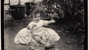
This can be particularly important with old negatives, many of which were designed to be contact printed, or enlarged only slightly, maybe 1.5x to 2x ("en-prints"). They were also developed to much higher contrast than is usual today. If you enlarge them too much (or at all, in some cases), it is not just sharpness that suffers, but tonality, too. I have some old 116 (21/2x41/4") family negatives which look fine as contact prints but start to look bad at even 2x. Consider investing in a box of post card-size paper, and don't be afraid of generous borders.

Darkroom Procedures
Taking more care in the darkroom can make a big difference. A very talented photographer of my acquaintance was not happy with her negatives when we first met. She was self-taught, and did not realize that temperature and agitation made much difference. Within a week of being told, she was turning out much more printable negs.

Nitrate negs--a real nightmare. Check the rebate on your old negatives. With nitrate base, the nightmare doesn't lie in the printing, but in the storage. If you find some, get rid of it quick! If it has begun to smell funny, get rid of it doubly quick.


There is also the alchemy of the photographic process. When it comes to film/developer combinations, one person's dream can be another's nightmare. Don't hesitate to change film, developer, or development time (or all three, though not all at once) if you aren't happy with your negatives.

Don't feel you are doing something "wrong" if you depart from the manufacturers' recommendations--the manufacturers themselves say, after all, that they are only recommendations and are always the best starting point.

Finally, there is another nightmare, which has nothing to do with negative quality. Some early films had a nitrate base. Even in perfect condition, this is highly inflammable. As it ages, it can become unstable and even explosive. If you don't detect any unusual smell from nitrate negs, it is probably safe to print them and/or copy them--well away from naked lights, sparks, and even hot light bulbs. The best thing to do with nitrate negatives is to destroy them. But if you want to keep them for posterity, seal them in a metal container and bury them in several feet of earth. Then advise posterity to leave them there!

X