Wedding And Portraiture
Just When You Thought You Knew Me
|
I keep growing, changing, and evolving. Nothing stays the same. I learn from experience and use my successes to trigger more. Some work, some don't. So, I decided to put together a few of my recent successful images and tell you how they were created. Maybe, just maybe, you'll try some of them and get ahead of me. One thing you should remember, however, is that all of my work is based on years of classical studies. Just as in music, photographers have to have a base knowledge on which to build. Perhaps, that's why I find myself so free to experiment. The posing and lighting are really not my experimentation. How I derive/arrive at that is where the fun is! Some of these images were created on Kodak film with my Hasselblad. Others were done with my Canon D30. Does it really matter? I think you'll agree, regardless, that they're all "Monte Style" through and through. So, let's see how they were each done. |
|||
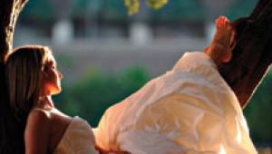
Where will I be going from here on? Who knows? I can tell you this, however, I won't stop growing. As long as I'm alive I intend to take advantage of all that's available to me. Life is fun. Life is great. Photography is an integral part of my life. No surprises there, huh? Image 1--This bridal portrait was created late in the afternoon. The bride was posed in a location that would let the afternoon direct sunlight backlight her veil and hair. The sunlight was too strong, so I placed a 4/6 ft translucent panel (#1707 Westcott Illuminator/Diffuser) so that it would soften the backlighting. I then used a Monte Illuminator (#1305 Westcott Silver/Black Illuminator/Reflector) as a source to bounce the main light onto her from my right. That's all it took. Of course, bringing her veil over her shoulders and arm helped to focus attention on her face and eyes. Be aware that a smile is not always necessary for a successful portrait, as witnessed here. |
|||
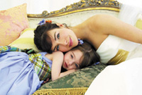
Image 2--A recent ad for Canon resulted in many images that were never seen. Here's one of my favorites. Notice how all the colors--eyes, gown, flower girl's dress, flowers, cushions, and the sofa--were all strategically and beautifully brought together by Mark Ellis, stylist for the shoot. Believe it or not, all the lighting is by window light. I had windows all around me. They were all controllable with shades. For this image I let light in from my right and from behind me. The same #1707 Illuminator/Diffuser softened the light from the window to my right. The window behind me was approximately 15 ft from the subjects. The face-to-face posing was an idea that I had carried with me from past successes with couples. |
|||
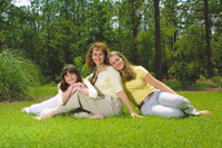
Image 3--The mother and daughters were posed in the middle of the day, their backs to the bright, direct sunlight. Exposure was for bright sunlight, so I used a strong flash, camera left, to bring the shadowed faces up to the brightness of the daylight around them. The sunlight coming from above and behind still held the highlights in the hair beautifully. The background was selected for its depth and the fact that the trees formed a rather solid background behind the figures. The tall grass on the left side of the portrait further enhanced the feeling of different levels of depth in the picture. Light clothing on all three of them blended the bodies together beautifully. In particular I'd like you to notice the way the bodies and hearts are all connected. This is a growing part of all my family groups. It is, perhaps, the most missing ingredient in some family portraits. |
|||
Image 4--An early morning photograph of this engaged couple was planned to capture an informal feeling of "promised eternal love." The first thing that I did to prepare for the portrait was to select the background. The trees (with filtered sunlight throughout) worked perfectly for me. I hesitated at first using that spot, because the strong morning sunlight seemed to be impossible to work with. Then, I got the idea of having people hold up the same translucent panel that was used in the previous photographs over the two of them. The prop was an artificial rock, easily placed anywhere I needed it. Her pose was a result of having posed many women on their side, the upper knee brought forward toward the ground. I needed to connect the two of them visually and physically. I had him hold his head up, but look down at her. Otherwise, I would have photographed the top of his head. Her profile showed up beautifully against his white shirt. Her hand up to his face was my way of completing the circle between the two of them. Exposure was based on the light that was falling on them. It worked perfectly with the trees behind them. |
|||
Image 5--This wasn't exactly what I was going for originally in this family portrait. The success of this picture, however, is from the unexpected, of course. The little girl simply didn't want to cooperate and sit where I had planned. I just pretended to go on without her. Soon, she began to return. This was as close as she would come. She still wouldn't look at the camera though. As it happened, she couldn't have found a better spot, could she? Her profile against the light background is just what I needed to make this one of my favorites. The light on their faces was simply light that was reflected off the white building behind me. All natural sunlight throughout the entire picture. Lots of depth--front to back! Image 6--Another difficult
family group culminated with a winner! The little girl actually smiled!
This was after a succession of trying all or most all of my tricks. I
was finally able to capture her smiling while her mother and brother looked
to see what she was doing. |
|||
I posed them with early evening sunlight coming from their right side, while someone held a reflector up to their left, bringing in directional light from that side, too. The open sky was the fill light. I had to lay flat on my stomach to position their faces up against the sky and keep from picking up a lot of unwanted background distractions. I actually straightened out the horizon line in Photoshop. I couldn't think of all those things at the same time. I was just lucky to pick up the one smile that the little girl had for me. Image 7--Who else combs everyone's hair before going into the pool, except for a family posing for me? This family group that you probably remember seeing recently took place in seconds! It had to. The water was freezing! I had recently made a more formal picture of this same family, so I had to come up with something different. Since they were visitors of my next-door neighbors, I thought of dumping them into the pool and going with that. |
|||
It's clear to see that two of the kids were not too happy with the water temperature. They would have smiled just to get out of the cold water! Exposure was based on my previous successes of exposing for the bright sunlight--1/125 at f/16--and using a strong on-camera flash set for the same intensity. Could not have been easier, at least, from my vantage point. The family loved it! Plus, they could see the results on the back of my camera seconds after they jumped out of the pool. Image 8--This portrait of mother
and son was made in the midst of outrageously gorgeous countryside. So
who cares? Not me! I was more interested in the bond between the two of
them. Dressing them both in denim was only the beginning. Her holding
him in her arms was the anchor to which I tied my vision. |
- Log in or register to post comments

