- REVIEWS
Camera Reviews 
More Reviews Mobile Reviews Photography Reviews - GALLERIES
- VIDEOS
- BUYER'S GUIDES
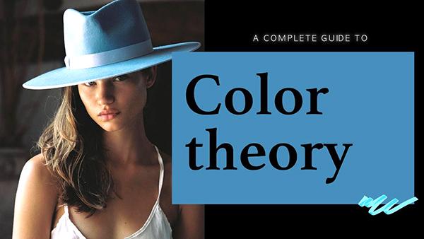
The Ultimate Color Theory Guide for Photographers (VIDEO)
A basic understanding of color theory is essential for capturing and editing all sorts of photos, be they landscapes, street scenes portraits, and pretty much everything else unless you're shooting in b&w. This holds true whether your intent is to depict exactly what you saw through the viewfinder or want to change the look and mood of an image during the editing process to achieve a particular effect.
Instructor Maarten Schrader is a professional travel photographer and an image-editing expert whose comprehensive tutorials provide step-by-step techniques for better imagery and creating a recognizable style of your own. This "essential" episode runs 20 minutes. So we suggest taking a few notes for future reference.
Some of Schrader's advice is admittedly subjective, but as he says, "you have to understand the rules before you break them. I love working with color because it's where we give life, character and style to our images." His goal for this lesson is to demystify the "science" behind color with practical examples and clear illustrations for putting these creative principles to work.
Schrader begins with a discussion of how certain colors play an important role in the emotions of a viewer. As he says, the color orange conveys a feeling of happiness, greens and blues tends to have a calming or contemplative effect, while other colors affect our mood in different ways.
Of course, the task of darkening or brightening colors with Vibrance, Saturation and Luminance tools also factors into the equation. Schrader also demonstrates how objects, props, clothing, and other colorful elements will help accentuate whatever feeling you're trying to convey.
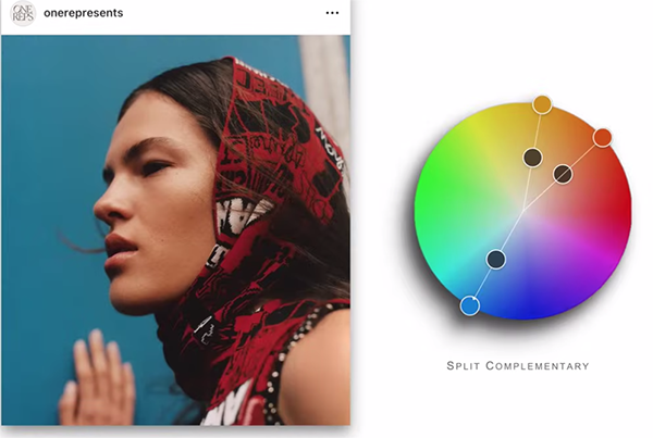
The concept of "hue" is another key component of color theory, and Schrader explains that the handy Color Wheel is made up of various hues, with subtle variations between the different tones. But here's the twist: There are actually multiple Color Wheels—one based upon RGB values (red, green, blue) that is of particular importance to photographers and Lightroom/Photoshop users—with others that are more useful to painters, graphic artists, and print makers.
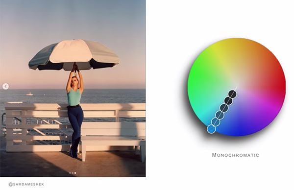
Color Temperature is another key post-processing variable and Schrader walks you through everything you need to know. And then there's the notion of Color Harmony that illustrates how certain colors are extremely impactful when used in combination (while others tend to clash). You'll also learn how to balance color to achieve a natural look, and how to edit an image to convey a specific feeling or mood.
Shrader's instructional YouTube channel is full of helpful image-editing videos, so be sure to take a look when you have time to explore.


![]()
Get the Latest Photo Tips, News & Reviews from Shutterbug!
| Camera Reviews Other Reviews | Mobile Reviews Photography Reviews Columns | News | Features | How-To | Resources |
 © 2025 Shutterbug
AVTech Media Americas Inc., USA
All rights reserved