- REVIEWS
Camera Reviews 
More Reviews Mobile Reviews Photography Reviews - GALLERIES
- VIDEOS
- BUYER'S GUIDES
Do YOU Know the Difference Between the Vibrance & Saturation Sliders? (VIDEO)
A primary goal of all photographers is to capture images with accurate colors, unless a special effect is the name of the game. When it comes to editing photos with skewed hues, Lightroom's White Balance tools are often sufficient for getting things right.
In certain circumstances, however, it's also important to understand the difference between Lightroom's Vibrance and Saturation tools if you want your image to convey what you saw through the viewfinder in the field. That's because these two sliders may work in similar ways, but the enhancements they make are decidedly different.
There's no one better to clarify this important distinction than instructor Julieanne Kost who's a self-proclaimed digital-imaging evangelist and an expert at all things Adobe. In this episode you'll learn everything you need to know in less than five minutes—so that photos with incorrect colors will be a thing of the past.
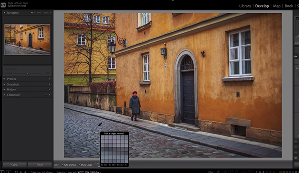
Kost pulls up a very nice street scene to illustrate how all this works, and she describes the challenge like this: "Cameras often do a good job of setting White Balance automatically, but there are times when we want to make small adjustments." Maybe you want to add a bit of warmth or cool off a shot to change the mood to suit your needs.
There are also times when you're uncertain which way to go, and Kost reveals how to use a dropdown menu and experiment with various Lightroom presets until you see exactly what you want. Keep in mind that if you're not working on a Raw file, the use of presets will be significantly limited.
Kost demonstrates how the Temperature slider can quickly come to the rescue. Another easy fix can be employed with photos where you know there's a color that should be neutral but isn't. This method involves employing Lightroom's White Balance Selector tool in the manner that Kost describes.

Another technique that many users prefer is to manually employ Lightroom's simple Saturation and Vibrance sliders. These adjustments provide more control for achieving perfectly balanced tones throughout a scene and Kost walks you through the simple step-by-step process she recommends. Some of the aforementioned enhancements can actually be used together for subtle and very refined results.
As you'll see, Lightroom provides a number of ways to achieve ideal colors. The trick is understanding which tool(s) to use when. Once you understand the concept you'll have it made in the shade (and in the sun too).
We strongly urge you to become familiar with Kost's instructional YouTube channel where there's an abundance of information for improving your workflow, or even solving problems that you confront on the fly.
And don't miss the tutorial we featured with another post-processing expert who demonstrates how to give landscape photos a beautiful, dreamy appearance with a Lightroom technique that anyone can master with ease.


![]()
Get the Latest Photo Tips, News & Reviews from Shutterbug!
| Camera Reviews Other Reviews | Mobile Reviews Photography Reviews Columns | News | Features | How-To | Resources |
 © 2025 Shutterbug
AVTech Media Americas Inc., USA
All rights reserved