Picture This

Sort By:  Post Date TitlePublish Date
Staff  |  May 17, 2012  |  First Published: Apr 01, 2012  | 
While it might seem odd to have fall colors in late winter, we thought we’d take advantage of the crop of image ops available when the contest began (those luscious fall hues) and to have a bit of color to fight off the winter blahs right now. In any case, readers sent in a host of images from all around the country showcasing the fantastic colors and richness of that very special season. Editing from all the photos received was tough, but we found numerous images that we hope that for you, like for us, was a reminder that seasons do change and that gray and cold (at least here in the Northeast) is not how it always is outside. Please note that while we did not limit the post-processing allowed on these images we tended to choose those where processing enhanced the image and did not overwhelm it.
Staff  |  Apr 05, 2012  |  First Published: Mar 01, 2012  | 
Fill flash, when applied appropriately, can bring out details, enhance color, and open shadows that might not be accessible if shooting with natural light alone. Our assignment for this month’s Picture This! was to bring a touch of fill to subjects that would benefit from this “taste” of light applied to a subject or scene. In most cases readers responded by using fill to highlight natural subjects, florals, birds, and the smaller creatures that inhabit the planet. Details became vivid, colors popped, and all the delight of nature’s design came to the fore.
Staff  |  Mar 06, 2012  |  First Published: Feb 01, 2012  | 
There is a school of thought that says that all good human design is derived from patterns in nature, and that we have a natural sympathy for objects that echo what we see around us in the natural world. Indeed, even the most abstract of human creations, be it painting, architecture, or simple tools, all seem to stem from what nature has taught and revealed. The subject of this month’s Picture This! assignment is Patterns in Nature, where we requested readers to go out and find those most pleasing, often intricate, and quite mysterious designs that we discover in the natural world and reveal through composition, lighting, and point of view with our cameras.
Staff  |  Feb 07, 2012  |  First Published: Jan 01, 2012  | 
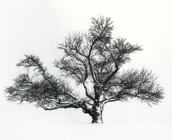
Our Picture This! assignment this month was Pen and Ink, in which we asked readers to send us images that emulated a pen and ink drawing, that is, reducing the image content to line, texture, and form. Software makes it easy to convert an image file to just about any type of illustrative format, from oil paint to pastels and more. There are many ways to achieve the effect, but as with all images it’s how the content matches the technique that counts. Readers sent in all types of subject matter and achieved the effect in various ways, all of which show how malleable images are these days and how working with software can open up new ways of seeing and sharing images.
Staff  |  Jan 12, 2012  |  First Published: Dec 01, 2011  | 
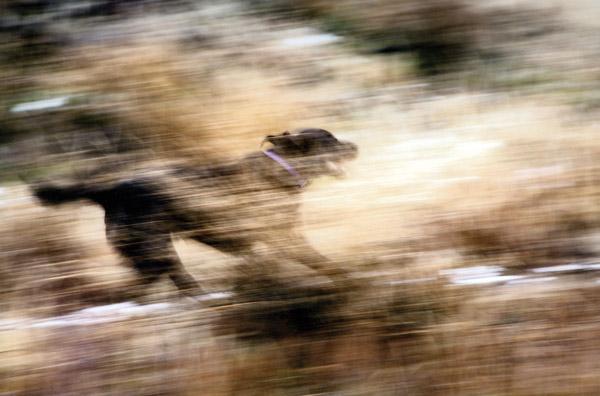
Our Picture This! assignment this month was Handheld Pan, a shooting technique that involves a long shutter speed and some sort of motion while shooting on the part of the photographer. We generally do everything we can to keep the camera steady and make sure there is no photographer-induced motion in a shot, including using image stabilized lenses, often elaborate tripods and heads, and even mirror lockup. The assignment requested just the opposite—adding motion to a shot that might include following a subject in motion across a plane, jiggling the camera to make lights record as lines rather than points, and even moving the camera in a circular motion to completely abstract the color and form.
Staff  |  Dec 16, 2011  |  First Published: Nov 01, 2011  | 
Our Picture This! assignment this month was Industrial Design. While nothing can beat the variety and beauty of nature, where patterns and designs have their own rhythm and pace, certain objects have a beauty and grace that speak to an aesthetic that is inherently human. Products of handmade origin or the Industrial Age that satisfy the need for function while maintaining a beauty of form are sometimes taken for granted, and sometimes, with a photographer’s keen eye, transformed into sculptural objects that seem to transcend their utility. We can contemplate them less for something we would use as a tool and more as objects of wonder or beauty that appeal to a deeper aesthetic sensibility. That’s what we sought, and found, in this month’s readers’ images.
Staff  |  Nov 16, 2011  |  First Published: Oct 01, 2011  | 
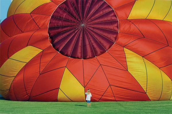
Composition dictates that we place a frame around the world before us. The lens we use, the depth-of-field effect we choose, and most importantly the elements of the scene we choose to include and exclude make up the final image. There are numerous compositional gambits, including sense of scale, where we include familiar elements in a scene to help establish size, distance, and, metaphorically, our sense of importance, or lack of same, of the object or subject used to establish that sense of scale.
Staff  |  Nov 03, 2011  |  First Published: Sep 01, 2011  | 
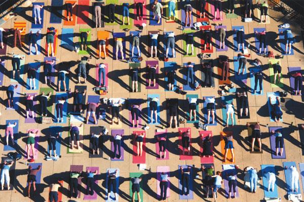
POV—point of view—is what this month’s Picture This! was all about. We asked readers to send in photos made from sometimes dizzying heights to show us all how where you stand and the lens you use can make for some great photo ops. Readers responded with some very exciting images of architecture, nature, and even people made from above. The results might just inspire you to take camera in hand and gain vantage points that make us all see the world in a brand new way.
Staff  |  Sep 12, 2011  |  First Published: Aug 01, 2011  | 
Our Picture This! assignment this month was Alphabet Soup, and we asked readers to go on a kind of letter treasure hunt and find either actual mixes of letters or naturally occurring forms that made the shape of letters. Some readers responded with literal, if you will, images and others found forms and shapes in nature and architecture and even sculpture that filled the bill. This is what you could call a “frame of mind” assignment, where once you begin to seek a particular form or shape you almost can’t help seeing that form around you.
Staff  |  Aug 16, 2011  |  First Published: Jul 01, 2011  | 
The world is rich in symbols, some more apparent than others, but if you put yourself in a “graphics” frame of mind, as we asked readers to do for this month’s assignment, you’ll find more than your share of images to capture in the world around you. The nature of this assignment was to find abstractions, to use context merely as a frame and not a reference, and to find the image within the image where a graphic presented itself. In many cases the frame becomes a canvas and the image something that abstract expressionists would understand. While we did receive some composites for this assignment we favored images made “in the field” that used cropping and a “graphic eye” to make the shot.
Staff  |  Jul 14, 2011  |  First Published: Jun 01, 2011  | 
Our Picture This! assignment this month was “Art Filters,” those in-camera special effects processing scripts that seem to be all the rage in cameras these days. Rather than have users spend time with computer software these days, camera makers are incorporating some interesting tricks into their imageware. You can think of them as subsets of Scene modes, as shortcuts, as fun filters, or as preprogrammed image processing effects that go right from camera to memory card. Readers responded with a host of images that display many of the “art” options and special effects available today.
Staff  |  Jun 14, 2011  |  First Published: May 01, 2011  | 

This month’s Picture This! assignment was Painterly Backgrounds, the use of various photographic devices—namely depth of field—to create a field of color and design for a backdrop to the main theme. The technique not only removes what could be a distracting background but also brings the main subject more into the visual attention of the viewer. It also can be used to complement the color, shape, and design of the entire frame, adding to the emotional content of the image. Readers sometimes used their digital darkroom skills to enhance some of the effects (noted in captions), but, as with other assignments, we view image processing as something that can be used to emphasize the image from the camera, not obtain it entirely from software techniques.

Shutterbug Staff  |  Apr 01, 2011  | 

Our reader assignment for this month was to explore a quality of light that brought out a glow in subjects and scenes. For the most part that meant working with strong backlight and sidelight in hazy or low-light conditions, but readers also, we note, added glow of their own through some post-processing steps. While this was okay with us for the most part, adding excessive glow that was not...

Shutterbug Staff  |  Mar 01, 2011  | 

Our Picture This! assignment was “Reflections” and we received many excellent images that took the assignment to the next level. Readers responded with reflections from many possible surfaces, including ponds, glass buildings, metallic objects, and more. The idea was to make the reflection part of an overall composition, to have it further reinforce the design, color, and forms of...

Shutterbug Staff  |  Feb 01, 2011  | 

Our Picture This! assignment for this month was on Trick Lenses and how they help us to see in ways that our normal perception does not allow. Readers responded with images that used accessory lenses, as well as glass that distorts light in fascinating ways. Some used scanners to create imagery, while others “squeezed” light through pinhole apertures. While photography is mostly used...

Pages

X