Site Links
|
 |
 |
 |
Wedding And Portraiture Black And White--Its The In Thing
By Monte Zucker February, 1999
| |
Photo 1.
Photos © 1999, Monte Zucker, All Rights Reserved
|
|
Black and white pictures
are no big deal--at least for me. I started in black and white many
years ago, but was thrilled to get out of the darkroom when color became
the “in” thing.
Now that black and white has had a resurgence of popularity, I’m
glad that there are some great labs out there that can produce fantastic
black and white (and sepia, too) without me having to go back into the
darkroom. Of course, there’s also the digital lab. We can process
black and white right in our computers, then print them ourselves or
send them out for negatives and photographic prints.
Let’s not discount any of these possibilities. Why not service
today’s market, stay on top of today’s trends, and make
everyone happy?
|
|
We first have to learn though
how to really take advantage of what the black and white medium has to
offer. It’s not just always a question of switching camera backs
and putting in a roll of the other film. To the contrary, there’s
much more to creating black and white images. But first we need to learn
what’s really inherent in great black and white images that make
them so attractive.
Black and white has almost an infinite tonal range, especially as compared
to color paper. This means that the black and white paper can retain detail
in photographs from very bright/light areas all the way to the darkest
areas. As a means of comparison, let’s say that black and white
has a range from 1-100, from the darkest to the lightest tones that can
be reproduced on paper.
|
|
Color film, on the other hand--especially
color paper--has, maybe, a range from 1-10. So, we have to compress the
complete range of tones in color to only that small difference which the
color paper can handle. Otherwise, when we print to get detail in the
brightest areas of the color photograph, the darkest areas will go completely
black.
Thus, when we’re using the black and white medium, we really should
take advantage of the wide range of tones that are available. Instead
of compressing the tones to just the small middle area, we should really
use lighting that goes all the way from the brightest to the deepest that
the paper can reproduce without losing detail. To switch film from color
to black and white, then, without changing the lighting ratios is not
really taking full advantage of what we can do in the black and white
medium.
It’s possible, however, to broaden the tonal values of a photograph
using a computer, regardless of how the picture was originally exposed.
|
|
Before we discuss that, let’s
talk about the new Kodak T-Max black and white film--T400CN. First of
all, it’s processed in the regular C-41 method, which means a regular
color lab can process the negatives for us in the same manner that they
process our color films. We don’t have to go into the darkroom,
ourselves.
Using this T400CN film you can get economical machine prints made, instead
of having to go to a custom black and white laboratory. Also, it’s
important to realize that most professional color labs can print larger
sized prints from these negatives than most black and white labs or what
you could make in your own home darkroom.
The lighting in Photo 1 was by three lamp heads coming out of Photogenic’s
800w PM08 power supply. Two main lights of equal intensity were used--one
at a 90° angle to their faces and the second just slightly camera-left.
The third light was used behind the background, directed onto the matching
curtain. I also used a fill light behind the camera, which was my regular
two f/stops less than the main light.
|
|
The picture was exposed on
color film. To get this black and white effect, I scanned the image into
my computer and through Photoshop I “desaturated” the image,
taking out all of the color. Then, I adjusted the image in “curves”
and created the complete range of tones that is so great for black and
white printing. With the file saved at a high resolution, I can now send
out for a negative or print it directly onto one of my printers in my
home office. I can also e-mail it anywhere in the world in seconds.
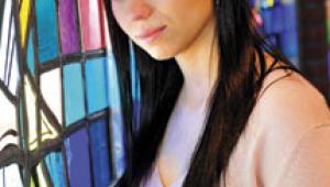
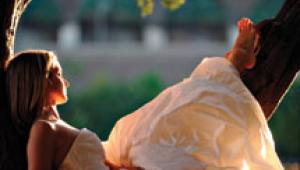
Photo 2, the black and white image of the bride and groom, was also originally
created in color. Notice how I’ve been able here to reproduce incredible
detail--all the way from the brightness of her dress and veil, down to
the outline of his completely black suit against the dark background.
This is almost reminiscent of the black and white I used to create on
location 40 or 50 years ago. I say “almost,” because my images
today are infinitely better. I really didn’t know what I was doing
way back then. I sort of just did “my thing.”
|
|
The close-up of the groom’s
profile over the bride’s face (Photo 3) and most of the pictures
all started out as color images. I already pushed the limits of the film
in this picture, before translating it to black and white, by spotlighting
the “mask” of their faces--from cheek to cheek. I did this
because I wanted to light her with my regular pattern, while keeping the
left side of his face in shadow. The spotlight effect was created by wrapping
a Shutterbug magazine around the open main light and directing it exactly
where I wanted the light to fall.
Notice in this image what an incredible range of tones is possible in
black and white--all the way from the detail in the brilliantly backlit
veil, down to the deep shadows of his face. By limiting the direct coverage
of the light with the magazine wrapped around the flash, I’m also
able to keep his ear in semidarkness, not a distraction in the photograph.
Then, here’s another fun thing that I do occasionally with images
on my computer (Photo 4). It’s all done by playing with the “curves”
in Photoshop. Great for the creative juices--and so easy. I sometimes
really love the results and so do clients.
|
|
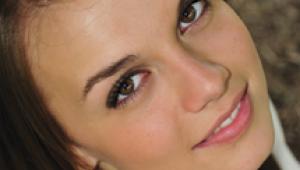
For Photo 5 I tried a different
lighting pattern to create the same effect as in the previous two images.
This time I placed the light in the position where I normally have it
for a profile. This created split-lighting on her and lit his profile
beautifully. Then, I used my reflector to wrap the light around onto the
shadowed side of her face and to keep the light from flaring into my lens.
All these portraits were created, by the way, with my Hasselblad and a
150mm lens on Kodak film.
With the light and reflector placed like this I really got a fantastic
range of tones from highlight to shadow. I kept detail in the color print
and stretched the tones still further in the black and white image using
Photoshop.
Talk about black and white-- doesn’t Photo 6 remind you of the Hollywood
glamour days? And it’s so simple to achieve. Two main lights, each
one lighting a profile and the back of the other person’s head.
Reflectors again blocked both of the lights from flaring into my lens.
Of course, the fill light retained detail in the sides of their faces.
This profile lighting is ideal for black and white photography. It can
show the complete range of tones that it is possible to achieve in this
medium.
|
|
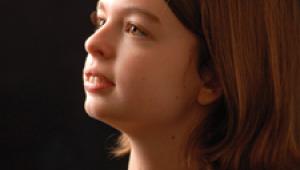
Photo 7 is another image that
was created directly on Kodak T Max film and printed in sepia. Wow. Just
take a look at what Tim Roberts caught at this wedding. Look at the detail
throughout--from the deepest black of the singer’s tux to the white
of the bride’s dress. The sepia effect really works here. Could
have been a picture made in the ’40s or ’50s--just what people
love to see again today.
Well, not exactly like what we used to do way back then. Study the lighting
in this one. That’s one of our Photogenic portrait lights being
used to light up the dance floor in our candids. We put a Fresnel lens
and barn doors on our two main lights for the reception pictures and light
up the background of our candids. We’re looking for the same f/stop
all over the dance floor as we’re using on our camera and on-camera
flash.
What an incredible way to light up our candids. No way you’re going
to get candids like this with just an on-camera flash, is there? Worth
the effort? You be the judge. Black and white or color? It works for both
of them. Either way, what a way to please your clients.
The last picture in this series (Photo 8) is one of the easiest to create,
and what an effect in black and white. All you have to do is direct a
single flash from behind the bride and groom onto the background. Overexpose
the background and you get any tone you want. With no lights on the subjects,
you have to get a silhouette like this. The champagne glass is lit by
the light bouncing back from the background.
Am I, personally, excited about the resurgence of black and white photographs?
I am when the full potential inherent in the process is achieved. I’m
not at all happy when the prints are just various shades of gray. But,
hey, that doesn’t ever have to happen again since you now know how
easy it is to achieve these kind of images--directly in your camera or
in your computer.
Yes, there’s a new world out there, but some things just continue
to last. I guess that’s why my style of photography--black and white
or color--is considered “classical.”
|
 |
|
 |
|
|
 |
 |
 |
|