- REVIEWS
Camera Reviews 
More Reviews Mobile Reviews Photography Reviews - GALLERIES
- VIDEOS
- BUYER'S GUIDES
Wedding & Portraiture
Color, The Enemy Of Form
This is not always the case,
but in many cases color does interfere with the reason for the photograph. |
|||
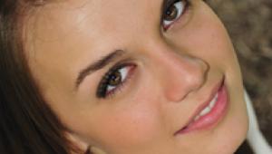
Now, let's look at Photo
2. I created this black and white image for Roberts' studio on Kodak's
T-Max 400 film during a color sitting just prior to her wedding ceremony.
The original was really nice, but not nearly as beautiful as this final
print. It, too, was enhanced in Photoshop. All I did there was to increase
the tonal range of the image. |
|||
And, speaking of that, let's
take a look at a couple of black and white images by Gary Bernstein. This
is true black and white, right from the get go. Photo 3, A.D. Mujik, was
Mr. Universe when Bernstein created the image with one light in his studio.
He used 35mm Plus X film. Lighting is everything, isn't it? Color?
Who needs it? Who wants it in a photograph like that? |
|||
It seems that many of my friends have been reinfected with black and white fever. Peter Lorber, my panoramic pal in Boca Raton, sent me a black and white image for this article. Travelers and locals, alike, may recognize this as Mizner Park, Boca Raton (Photo 5). But has anyone ever seen it with an eye like this? Yes, this is definitely one of those times where less is more. Without the color you see--really see--what's there. Color may not really be an enemy here, but when it's absent, doesn't it give you a great feeling of peace? |
|||
Two more friends of mine are great exponents of black and white. Although they're both known internationally for their newly discovered digital talents, they're both right at home with the camera, and with black and white film. |
|||
Here, for instance, are two striking images by Robert Hughes. His images, Detail from the Pearly Gate (Photo 6), and Sycamore Tree (Photo 7), are masterful reasons for flipping over black and white images. Shape, form, and texture are all there--just no color. And you know what? Who misses it? |
|||
Richard Pahl's profile portrait (Photo 8) is still another variation beautifully achieved without color. The shockingly white hair of this man is emphasized against the rougher skin of his face and hands. Delicate lighting and printing achieve more here than the portrait ever could in color. Your eye goes just where Pahl wants to lead you. It's all there. Nothing missing! |
|||
No, we're not at war with color. It's just that nothing is obscured in these images, reproduced here for your visual pleasure. Black and white doesn't have to compete with color any more. Now that the novelty of color is accepted by everyone, isn't it great that we're once again recognizing the validity of black and white? |


![]()
Get the Latest Photo Tips, News & Reviews from Shutterbug!
| Camera Reviews Other Reviews | Mobile Reviews Photography Reviews Columns | News | Features | How-To | Resources |
 © 2026 Shutterbug
AVTech Media Americas Inc., USA
All rights reserved