- REVIEWS
Camera Reviews 
More Reviews Mobile Reviews Photography Reviews - GALLERIES
- VIDEOS
- BUYER'S GUIDES
Output Options; “Soft” Proofing; See How The Print Will Look, Before Printing
OK, you've done all the right things--you've calibrated your
display using one of the hardware devices such as the X-Rite i1Display 2, Pantone
huey, or ColorVision Spyder2. You've set your Photoshop work space up
correctly, using Adobe RGB or ProPhoto RGB as the color space for your documents,
and you've made all the right selections in the printer driver to get
the most accurate prints your system is capable of. So, why do the prints still
not look right?
Sure, you can often get a print that is a very close match to what you see on
screen, particularly when using an RC photo paper like gloss or luster. But
with some images, you just don't get the same results you expect. Especially
when printing to fine art papers, colors often seem washed out when compared
to what you see on screen. This isn't something you're doing wrong,
it's just the reality of paper and ink combinations. Photoshop and your
printer are still giving you the best match possible, it's just that best
isn't always good enough. So, what to do?
Well, if you use the full version of Photoshop (sorry, but Elements doesn't
work here), there's a great feature called soft proofing that can save
you time, money, and frustration. Time is saved because you no longer have to
wait until the print is done to see what the results will be, money because
you don't need to do multiple prints on expensive paper to get the image
you envision, and frustration because you haven't wasted the first two
items!
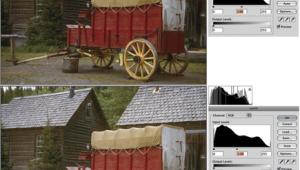
Let's take a look at how soft proofing can work for you. To get started,
choose View>Proof Setup as shown in #1. From the list of options, select
Custom to display the Customize Proof Condition dialog.
 |
|
|
This dialog contains everything you need to simulate how your image will look
on paper. The first step is to select the right printer and paper combination
from the Device to Simulate list. This list contains all the installed profiles
on your system (you'll recognize these as the same ones displayed when
selecting a printer profile). So, if I wanted to see how my image would look
when printed on glossy paper to a Canon iPF6100, I'd select that profile
from the list.
The other options to set in this dialog are the Rendering Intent, which should
be either Relative Colorimetric or Perceptual, and Simulate Paper Color. Black
Point Compensation should also be checked, and be sure that you do not check
the Preserve Numbers option, as it will throw everything off for our purposes.
Finally, unless you want to play with different settings here to see what type
of paper to use, turn off the Preview check box.
 |
|
|
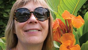
Image 2 shows how my print would look if I choose to use glossy paper. For a stark contrast, you can see how different the print looks when choosing a fine art paper in #3. Same printer, same ink, different paper properties. This is where most people see the output and wonder what went wrong. In fact, nothing went wrong at all, you're just expecting more than is possible for the media you selected.
 |
|
|
So, the first step in getting a print that matches your vision is selecting
the appropriate paper for the image. In the examples shown earlier, a fine art
paper is clearly not the best option. For the highly saturated hues in this
floral shot, a gloss or luster paper is the only choice if I want to get that
color to pop.
|
| |||||||||


![]()
Get the Latest Photo Tips, News & Reviews from Shutterbug!
| Camera Reviews Other Reviews | Mobile Reviews Photography Reviews Columns | News | Features | How-To | Resources |
 © 2026 Shutterbug
AVTech Media Americas Inc., USA
All rights reserved