- REVIEWS
Camera Reviews 
More Reviews Mobile Reviews Photography Reviews - GALLERIES
- VIDEOS
- BUYER'S GUIDES
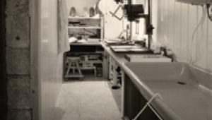
The Darkroom
Setting The Black Point; A Key Step In Getting The Right Tonal Range
One of the secrets to making
great ink jet prints is to set the black point correctly in the image
file before sending the image to the printer. The black point in an
image is the group of pixels that should be printed as solid, D-max,
black. If this setting is made correctly, it will establish a correct
tonal range for the image, which means that there will be a correct
distribution of shadows and highlights. You will have the proper density
in the shadows to allow you to have a maximum of shadow detail as well
as a maximum of detail in the highlights. As with many procedures in
Photoshop, different experts have different opinions on just how to
set the black point. So, before you all start writing in to tell me
how wrong I am, let me say up-front that this is how I set the black
point in my images, and this is why I do it this way. You're free,
to experiment with better options. |
|||||||
Next, go back to Layer to New
Adjustment Layer to Threshold. When the Threshold New Layer window opens,
click on OK. That will open the Threshold adjustment window and will immediately
turn the image into a high contrast, black and white view as shown in
#2. In the Threshold adjustment window notice the little arrowhead under
the histogram (#3). Grab the arrowhead and drag it all the way to the
left and the image will go to solid white. Then, slowly drag the arrowhead
back to the right until you get just the beginning trace of some black
pixels (#4). |
|||||||
Next, go to the Layer Palette
(#6) and double click on the first square for the Curves adjustment layer
that we created earlier (see the red arrow in #6). That will cause the
Curves adjustment window to open (#7). |
|||||||
At this point, some experts
will tell you that you have correctly set the black point. I disagree. |
|||||||
Here's where I differ with some of the experts on setting the black point by this method. If you set a D-max area to RGB "0" (as we have done earlier), the ink jet printer will lay down considerably more ink than necessary to establish D-max. This means that slightly lighter shadow tonal areas will also be getting a whole lot more ink than is necessary, causing some of them to also go to D-max when they should have printed a little lighter, thus producing more visible detail in the shadows. The way to prevent this excessive ink lay down, and to get much better shadow detail, is to set the black point to something between 10 and 13 instead of "0." Here's how I do that: |
|||||||
In #9, you see the Curves adjustment window as it first opens when you double click on the Curves layer back in #6. If you will go down to the bottom left corner of the Curves adjustment window and grab the end of the diagonal line, then drag it up just a little (#9), you will lighten the black point. In fact, if you will keep your eye on the Info Palette window (#8) while you are dragging the diagonal line up, you will see the values of RGB changing from "0" to the desired 10-13 units that I mentioned earlier. In this example, I have set the black point to 12 units. The 12 units show up in the Curves adjustment window down at the bottom as "Output" = 12 (#9). The last fine tuning, which you might want to do, is also done in the Curves adjustment window. Drag the window off to one side so you can see the bulk of your image and then bend the curve into a very gentle "S" shape. This will produce a slight increase in contrast in the image, and should be done according to your personal artistic taste. There is no real right or wrong. Image #10 shows my finished image. As you can appreciate, the subtle shadow details will not reproduce very accurately in the magazine, but I can assure you that the subtle shadow detail can be clearly seen in a real ink jet print. For more information visit my website at: www.colorbat.com. |
|||||||
|
|
||||||
|
|
||||||


![]()
Get the Latest Photo Tips, News & Reviews from Shutterbug!
| Camera Reviews Other Reviews | Mobile Reviews Photography Reviews Columns | News | Features | How-To | Resources |
 © 2026 Shutterbug
AVTech Media Americas Inc., USA
All rights reserved