Addition By Subtraction; Tips For Effective Environmental Portraits
I consider the photographs I take of people to be environmental portraits,
even though there are no elaborate props or backgrounds in the images. I suppose
I define "environmental" as adding a context to the photograph,
or suggesting a lifestyle, interests, or relationships.
And when I'm taking photographs of people, less is definitely more. A
good thing, too: whether you're an amateur or a professional, most of
the time when you're photographing people you're juggling so many
things, and working so hard, to get to their personality, even their emotions,
that eliminating distractions and emphasizing essentials makes for better photographs.
 |
|
|
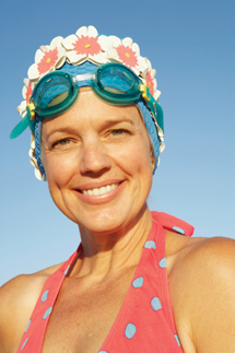
Take the photograph of the woman with the swimming goggles. It's basic
and direct, and it tells you what you need to know about that person. More important,
it tells you what I wanted to convey. I shot at that angle so the sky becomes
the background and distractions are eliminated. The goggles were positioned
so that they wouldn't distract from her face and her expression, but they're
still positioned prominently so that you know what I want you to know about
her. Of course, there's a retro look here: check out the cap and swimsuit
style. Everything in this photograph is tied together to convey a single message
about the person, and it works because it deliberately eliminates anything and
everything that's not important to that message.
An environmental portrait, whether I make it on location with people I've
met or models I've hired, doesn't need a lot of detail to suggest
what's happening. I've learned that most of photography is about
eliminating, not adding. No offense, but the mark of the amateur picture is
clutter and detail; or, often, too much detail that becomes clutter. The more
you shoot, the more you eliminate; the better you are, the simpler, and more
readable, your photographs. Everything in the frame should have a purpose. The
bonus is that the people you photograph will often have the essentials with
them.
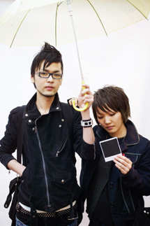 |
If they don't, there are still things you can do. Take a look at the
photograph of the two young people in the black jackets. They're not models,
just people I saw on the street in Tokyo. I stopped them and said, "You
guys look cool. Can I take some photographs?" I took shots of them individually,
then handed them the white umbrella. "Would you hold this?" They
did, and I got more photos. I had a Polaroid camera with me so I'd be
able to give photos to people I met and photographed. In their case, I photographed
them just as I handed them a picture. That photo--the one you see here--was
the winner. It wasn't hard to get them to help me. There was a little
gentle persuasion, no doubt, but notice that I chose people who not only looked
very cool, but who, I felt, obviously set out to look cool. All I was doing
was noticing, and appreciating, their efforts.
Take advantage of what people are doing--that's the essence of the
environmental portrait. Don't distract them; rather, go with what they're
doing and who they are. A person you meet in a marketplace can be the same kind
of willing subject. All it takes is, "Can you hold this basket of tomatoes
while I take a picture?" and you have a good chance of getting a simple,
direct environmental portrait. Just be sure to buy something!
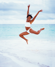 |
Sometimes it pays to learn as much as you can in the short time you may have.
The girl I photographed on the beach was a model I'd hired, but the photo
you see didn't happen because she was hired to be photographed. I'd
photographed her all day, but it wasn't until the end of the session that
she mentioned that she was a professional ballet dancer and asked me if I'd
mind taking a shot for her. Mind? Are you kidding? So I photographed her leaping
and dancing and got not only great shots for her to use, but several for me
as well. So be smarter than I was: talk to the people you're photographing
and see what their stories might inspire.
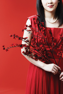
A final word on environmental portraits: get graphic. For example, the image
of the girl in red--which is sort of a contradiction. I consider it an
environmental portrait, but strictly speaking, where's the portrait part?
You can't see all of her face; you don't see her eyes at all. What
I stressed here is color: the red flowers, dress, background, and lipstick--all
of which indicate, but don't specify, the person. So there's mystery
here--and, I think, a pretty strong portrait.
 |
All of these photos are relatively simple as far as their result and impact,
but that doesn't mean they're easy to create. I have to work very
hard to get this simple.
Because most of my photos are for stock and commercial use, I don't include
a lot of street and crowd scenes, but you can if you like. Just be sure they
add atmosphere, not distraction. Keep your images, especially your portraits,
easy to read.

