Site Links
|
 |
 |
 |
Passport Color Is Content
By Jack Hollingsworth April, 2001
| |
|
I walked around a Buddhist monastery in China one rainy
day looking for images; waiting, watching, resting, taking
in all the things around me that were strange and new.
I watched this bench, saw people come and go, sit and
wait. I loved the simple composition, but again, it was
the color that attracted me. I took many shots at different
focal lengths. I was so relaxed being there, so peaceful,
and I knew the choice of colors--the whole place is done
in orange, maroon, and saffron--was deliberately designed
to relax the people who live there and who visit. The
scene, and the color, spoke to the emotional state of
mind I was in. (Nikon F4, 35-70mm f/2.8D AF Zoom-Nikkor.)
Photos © 2000, Jack Hollingsworth, All Rights Reserved
|
|
I’ve spoken to photographers
who believe that "color for color’s sake" is a crutch, a cheap
shot, because a photograph based on color is not doing what a photograph
should do. It doesn’t tell you anything, doesn’t reveal
anything about a place or a person. There are no telling details. These
photographers define "content" as the message of the picture, the information
the photograph provides. Color, they say, should support the message
but not be the message. Color is never the meaning of the photograph.
Hogwash.
First, let’s think about
this: what are our eyes attracted to as we move around? What is often
the first thing we see, especially if we are traveling in surroundings
very different from our own? Most photographers are attracted by light,
composition, gesture, and mood. But I’ll bet that all are attracted
first by color. I know I am. I see color before I see anything else.
I literally see it before composition, before light. I’m stopped by
it.
Secondly, I reject the methodical,
analytical approach to photography that says, "If you don’t see meaning
in it, don’t shoot it." And the commercial corollary: "If it doesn’t
have a commercial application, don’t shoot it." I say, "If it’s personal
or emotional, shoot it."
|
| |
|
The photograph of the fence against the sky was taken in
Uruguay. I was driving near the shoreline and saw the barrier
fence front-lit by the rising sun. I took a series of six
or eight shots, getting closer and closer, and this one
is the next to last. Color was the main attraction: the
colors in the sky and the earth tone of the fence against
that mix of blue and white. Early morning is not only great
for the softness of the light, but it’s also one of my favorite
times to shoot because I can set up with the sun over my
shoulder with my subject front-lit. (Nikon F4, 24mm f/2.8D
AF Nikkor.) |
|
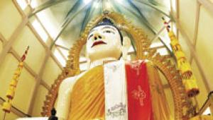
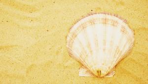
"Color is content" is based
on emotion. That’s the heart of it. Wherever I travel, when I see color
I stop. And then I go to work using the other building blocks of an image:
composition, light, time of day, lens choice. But often it’s my emotional
reaction to color that starts the process. And whether I think the picture
has a commercial value or not, I have to take it.
The photographs you see here
are examples of that idea. Color was what first attracted me, and color
is the subject. They’re not Pulitzer Prize-winning pictures; they’re pictures
I was drawn to and pictures I took because of their emotional appeal.
Sometimes color makes you take
the picture, and that’s the way it ought to be.
|

In
Tobago, West Indies, I was stopped by the three shades of blue
in a scene of a boat on the beach. I took the photo with no filter,
no effects, no color manipulation--you’re seeing what I saw. I
took a lot of photographs, moving in closer and closer until I
was satisfied. In this picture I’m so close you lose a lot of
information about the surroundings, but so what? The subject here
is color. (Nikon F4, 20mm f/2.8D AF Nikkor.)

My
wife and I were in Singapore when we saw the painted bicycle--it’s
actually part of a "tri-shaw," a bike with a sidecar. It was the
particular green color, and the homemade paint job in general,
that attracted us. Someone cared for that bike, but obviously
was in a hurry to do it. We moved the bike so the red cloth provided
a background. I took several shots, but this one, isolating just
this section of the frame, is my favorite. Interestingly, this
photo has become one of my signature images, not because I say
it is, but because others react so well to it. It’s been published
over 200 times. That shows me that my personal choices not only
please me, they’re also of value to others. I didn’t take this
picture to make sales, but it turned out to be commercially viable.
Color sells. (Nikon F4, 80-200mm f/2.8D AF Zoom-Nikkor.)
|

This
image is isolated from a confusing scene. I was driving down a
busy road when the color leaped out at me from 500 yards away
through the confusion of a bustling neighborhood. I thought, what
is that? And I realized that if I could get that question--what
is that?--into a picture, then I’d have something. Again, color
drew me into the scene. What is it? It’s cloth hung out to dry
at a thread-making factory. By the way, a lot of people don’t
like the "what is it?" idea. They want a photograph to tell us
everything and to give us all the information. I don’t agree.
I like some photographs to ask questions, to leave us with a bit
of mystery. (Nikon F4, 300mm f/4 AF Nikkor.)

A
cruise ship with the red hull was tied up at a dock in the Bahamas,
and I don’t think I’d ever think of photographing the side of
a ship if it wasn’t…well, so "red." And the blue ropes didn’t
hurt, either. This is a great example of color attracting me to
the image. The bright red invited me to pull this picture out
of a confusing, messy scene of dockside disorder--there were people,
clutter, trash everywhere, but I moved in and framed with a telephoto
to isolate exactly what I wanted. And what I wanted was color.
(Nikon F4, 80-200mm f/2.8D AF Zoom-Nikkor.)
|
|
 |
|
 |
|
|
 |
 |
 |
|