- REVIEWS
Camera Reviews 
More Reviews Mobile Reviews Photography Reviews - GALLERIES
- VIDEOS
- BUYER'S GUIDES
The Darkroom
The Lowdown On VC Papers; A Versatile Choice For A Variety Of Negatives
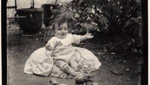
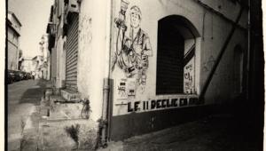
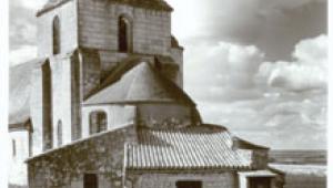
Photos © 2004, Frances E. Schultz, All Rights Reserved
How brown do you like your toast? The answer, of course, is "It depends."
What kind of bread is it? How old is the bread? How thick? What are you going
to put on it? How are you feeling at the time? You can't make hard and
fast rules, even for yourself. It's even harder to make toast for someone
else. How many domestic battles have centered around the settings on the toaster?
Photographic printing is very much like making toast: it's a question
of personal preference and how you are feeling at
the time. Your toast (and prints) may well differ from mine, so we need to be
able to make whatever adjustments suit
us personally.
 |
|
|
That's the wonderful thing about Variable Contrast (VC) paper. With just one box of paper you have up to seven contrast grades, and everything in between. If you want a different image tone, buy just one more box of paper: warmtone, cooltone, or neutral.
How Does VC Paper Work?
VC papers are coated with two emulsions, one high-contrast, the other low-contrast.
One is sensitized to blue light and the other to green. More green light (or
less magenta) means lower contrast; more blue light (or less yellow) means higher
contrast. By mixing either green and blue or yellow and magenta light in different
proportions, you can choose a stepless range of contrasts from Grade 00 (very
soft) to Grade 5 (hard).
 |
|
|
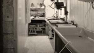
What Kind Of Enlarger Do I Need?
You can use any enlarger to print VC paper as long as you can place VC filters
into the light path. These can go under the lens or into a filter drawer between
the light source and the lens.
You can also buy special VC light sources. These are of two types: dial-in magenta
and yellow filters, or cold light sources with blue and green light. VC light
sources are most convenient because you can make very subtle changes, although
anything less than a quarter of a grade is usually too subtle for anyone but
a printer to notice.
There are different generations of VC filters. The current ones from Ilford
are Multigrade IV. I find that my Multigrade IV filters used under the lens
tend to give 1/4 to 1/2 grade more contrast than my Meopta Meograde VC head.
Remember different manufacturers' filtration will give you different results.
I can only report the results from the equipment which I have. Make your own
tests.
Color enlargers can be used for printing VC papers as well. The principle is the same. Using the magenta and yellow filters, you dial in certain values for the grade you want. Check the paper manufacturers' recommendations, or see the table above. There have been quite a few charts published which give the values you should dial in. Not all of these charts agree. This one, courtesy of Ilford, is the one Roger Hicks and I published in our book Darkroom Basics (Collins and Brown, 2000). These values are for constant exposure times; you can use just yellow or just magenta filtration but you will need to change the exposure time with each setting if you do.
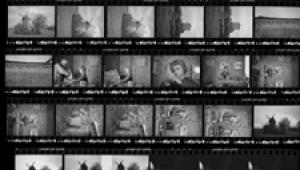
How Do I Choose A Contrast Grade?
The quickest and easiest way to establish the optimum contrast grade is via
test strips. Make one set to determine exposure, and a second set to determine
contrast at the chosen exposure. It is usually very easy to say, "This
looks better than that," even if you aren't sure of the theory behind
what you are doing.
I often use a Nova Step & Repeat Printer. I like it because it allows me
to make six exposures of the same area on the print on only a half sheet of
8x10" paper. You can make something similar yourself out of card, with
careful cutting, or you can simply use the old-fashioned approach of small torn
strips of paper. Keep a soft pencil handy to write the contrast grade on the
back of torn strips.
Wash them, dry them, and then decide which looks best. Drying is important:
"dry down" can lose up to half a grade of contrast, depending on
the paper.
As you gain experience you will find that contrast determination becomes second
nature, especially if you use the same film, developed the same way and printed
on the same paper, developed in the same developer. But even then you may need
to burn part of a print at another contrast, as explained later. This time,
make sets of test strips for different areas of the image.
 |
|
 |
|
|
|
| |||||||||


![]()
Get the Latest Photo Tips, News & Reviews from Shutterbug!
| Camera Reviews Other Reviews | Mobile Reviews Photography Reviews Columns | News | Features | How-To | Resources |
 © 2026 Shutterbug
AVTech Media Americas Inc., USA
All rights reserved